Embed Size (px)
Citation preview
tomie ohtake
pintura e pureza
constante de cada um deles, nunca isoladamente,
mas através da variação de seus pesos, por exemplo,
modificando o tratamento de um, enquanto os outros
dois eram mantidos em suspensão relativa, ou a
modificação simultânea dos três, tudo isso foi se
revelando como um jogo caleidoscópico, uma tessitura
movente reveladora de prismas insuspeitados.
Cor, gesto e matéria, não por acaso, perfazem o
mote da exposição Tomie Ohtake – Correspondências,
organizada por mim e por Paulo Miyada, levada
simultaneamente a esta no centro cultural que leva seu
nome, Instituto Tomie Ohtake. A prova que cor, gesto
e matéria são aspectos igualmente importantes para a
grande maioria dos artistas contemporâneos a Tomie
Ohtake fica patente nessa reunião entre a nossa artista
e 53 outros pertencentes a gerações variadas. E a
tomie ohtake
pintura e pureza agnaldo farias
A busca persistente da purificação, do desbastamento
de tudo quanto seja supérfluo, reduzindo sua expressão
ao estrito para obter o registro mais elevado, afigura-se
como o principal ensinamento que a extensa trajetória de
Tomie Ohtake oferece à arte brasileira e ao público que
sempre a acompanha com interesse, seja ele aficionado
ou leigo, ou ainda seus colegas artistas. Uma contribuição
da natureza daquela oferecida por sua obra só poderia
mesmo ser sentida ao longo do tempo, com a exposição
regular das séries de pinturas, gravuras e, a partir dos
anos 1970, de esculturas. A comparação de uma série
com a seguinte foi deixando ver o rigor no calibramento
e aprofundamento dos problemas enfrentados. A lida
sistemática com o gesto, a cor e a matéria, o trinômio
basilar de sua poética – descontando-se aí suas esculturas,
geralmente realizadas em metal, monocromáticas e
com cores aplicadas homogeneamente –, o burilamento
prova da extraordinária qualidade da sua contribuição
evidencia-se no cotejamento de seus resultados com
os de seus colegas.
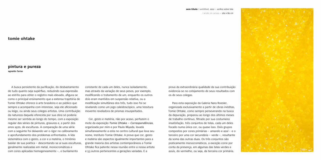
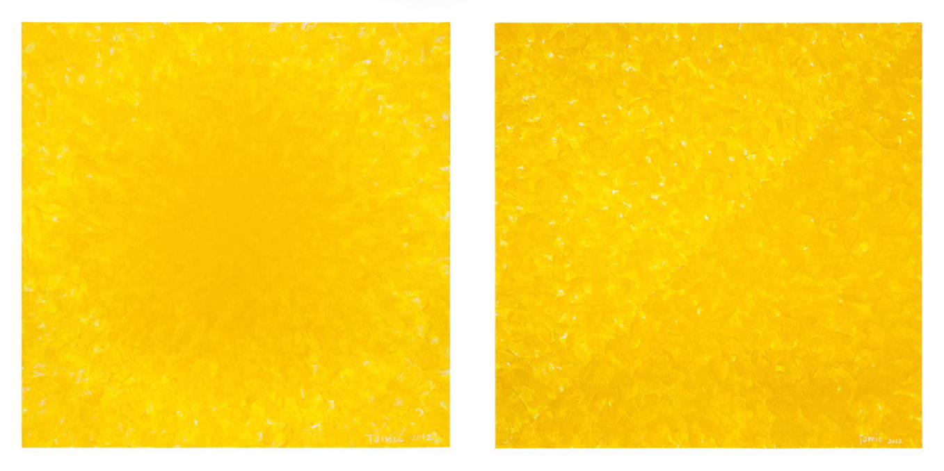
Para esta exposição da Galeria Nara Roesler,
organizada exclusivamente a partir de obras inéditas,
Tomie Ohtake, como sempre perseverando na busca
da depuração, preparou ao longo dos últimos meses
de trabalho contínuo, filtrado por sua costumeira
insatisfação, três conjuntos de telas, cada um deles
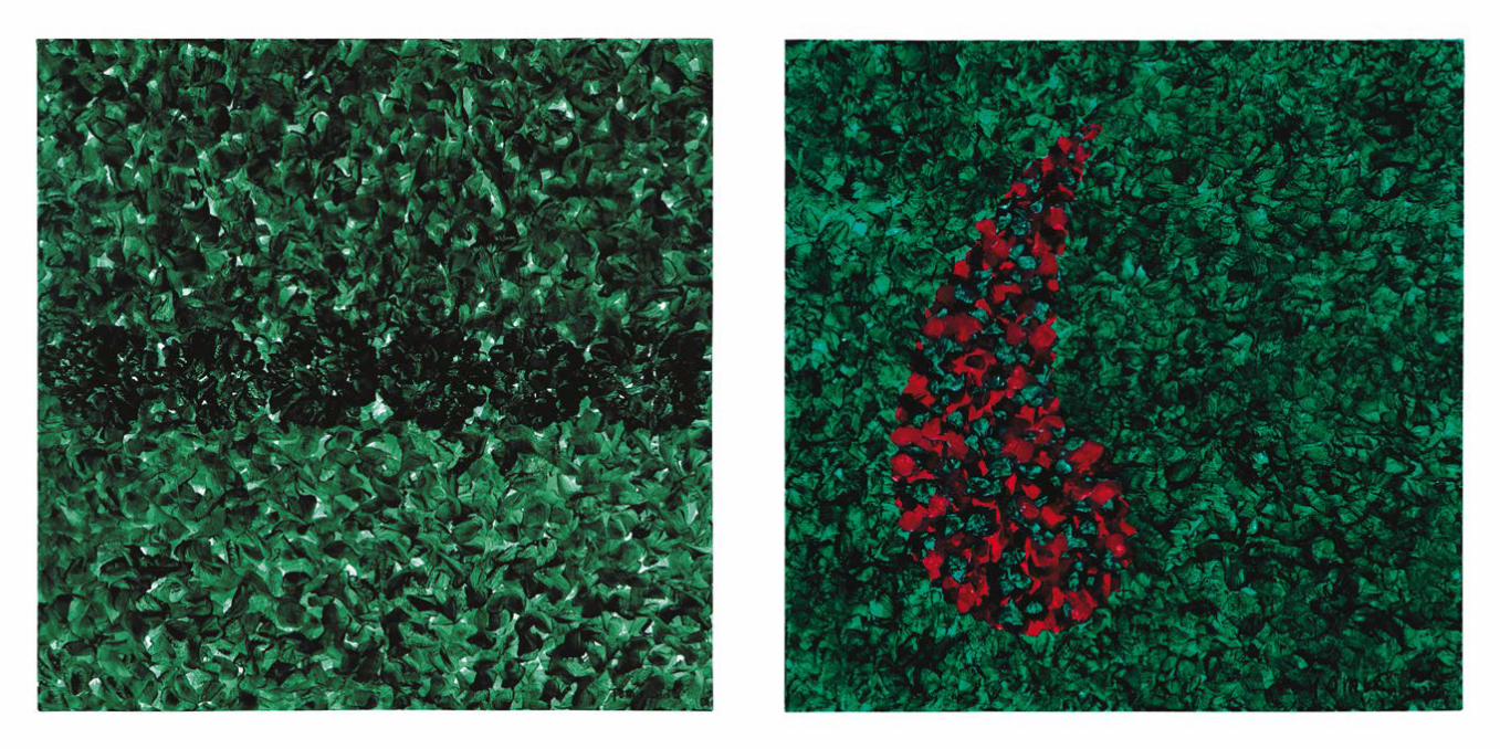
focado numa única cor, ou quase isso. Dois grupos
compostos por cores primárias – amarelo e azul – e o
terceiro por uma cor secundária – verde –, resultante
da soma das outras duas. Os três conjuntos são
praticamente monocromáticos, a exceção corre por
conta da presença, em algumas das telas verdes e
azuis, do vermelho, ou seja, da terceira cor primária.
sem título / untitled, 2012 -- acrílica sobre tela
/ acrylic on canvas -- 160 x 80 cm
mão que empunha o pincel, enquanto se submete ao
embate entre as forças da razão e as do desejo.
Indo do geral para o particular, das telas
monocromáticas para os casos em que elas são
“atacadas” pelo vermelho, concentremo-nos não
no azul, amarelo ou verde, mas simplesmente
no fenômeno da cor. Como Tomie Ohtake nos
explica, através dessas suas pinturas, a cor nunca
é simplesmente a cor, mas algo que acontece num
corpo, seja ele disperso em corpúsculos ou tangível,
sob a forma matéria densa, dura e compacta.
Limitando-se a pensar na tinta que a artista aplica
sobre a tela, ela pode ser mais ou menos viscosa,
rala ou encorpada, brilhante ou fosca, transparente
ou opaca, pode ainda estar situada entre qualquer
ponto de gradação de um dos pares enunciados. Não
bastassem essas possibilidades, há que se considerar
o ângulo em que a luz incide sobre a cor aplicada
sobre a superfície da tela, a quantidade dessa luz
e, por fim, a posição do observador. O fenômeno é
infinito, posto que a cor não existe abstratamente,
mas como coisa tangível.
A palpabilidade da cor é efeito da solubilidade do
pigmento e, considerando o processo empregado
por Tomie Ohtake para a confecção de suas telas,
também ocorre pela maneira como ela, nesses três
conjuntos apresentados, ataca a superfície com o
pincel. O recobrimento de cada tela dá-se, como
já foi mencionado, através de gestos curtos e
semicirculares, produzidos como que por uma torsão
do pulso. Esse movimento encharca a tela no ponto
de partida da ação, quando o pincel pousa sobre ela,
pressionando-a, distende-se quando desliza, adensa-
se novamente quando termina. De perto se percebe
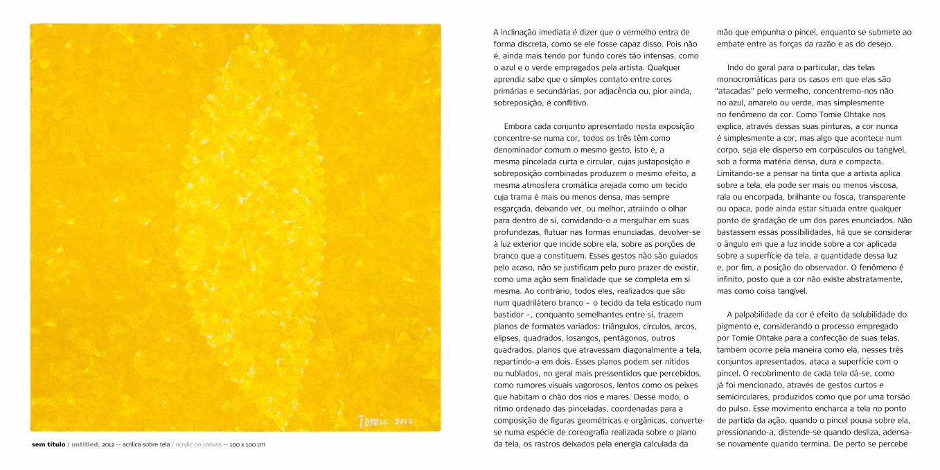
A inclinação imediata é dizer que o vermelho entra de
forma discreta, como se ele fosse capaz disso. Pois não
é, ainda mais tendo por fundo cores tão intensas, como
o azul e o verde empregados pela artista. Qualquer
aprendiz sabe que o simples contato entre cores
primárias e secundárias, por adjacência ou, pior ainda,
sobreposição, é conflitivo.
Embora cada conjunto apresentado nesta exposição
concentre-se numa cor, todos os três têm como
denominador comum o mesmo gesto, isto é, a
mesma pincelada curta e circular, cujas justaposição e
sobreposição combinadas produzem o mesmo efeito, a
mesma atmosfera cromática arejada como um tecido
cuja trama é mais ou menos densa, mas sempre
esgarçada, deixando ver, ou melhor, atraindo o olhar
para dentro de si, convidando-o a mergulhar em suas
profundezas, flutuar nas formas enunciadas, devolver-se
à luz exterior que incide sobre ela, sobre as porções de
branco que a constituem. Esses gestos não são guiados
pelo acaso, não se justificam pelo puro prazer de existir,
como uma ação sem finalidade que se completa em si
mesma. Ao contrário, todos eles, realizados que são
num quadrilátero branco – o tecido da tela esticado num
bastidor –, conquanto semelhantes entre si, trazem
planos de formatos variados: triângulos, círculos, arcos,
elipses, quadrados, losangos, pentágonos, outros
quadrados, planos que atravessam diagonalmente a tela,
repartindo-a em dois. Esses planos podem ser nítidos
ou nublados, no geral mais pressentidos que percebidos,
como rumores visuais vagorosos, lentos como os peixes
que habitam o chão dos rios e mares. Desse modo, o
ritmo ordenado das pinceladas, coordenadas para a
composição de figuras geométricas e orgânicas, converte-
se numa espécie de coreografia realizada sobre o plano
da tela, os rastros deixados pela energia calculada da sem título / untitled, 2012 -- acrílica sobre tela / acrylic on canvas -- 100 x 100 cm
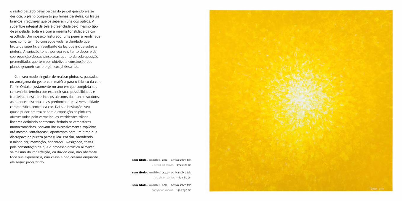
o rastro deixado pelas cerdas do pincel quando ele se
desloca, o plano composto por linhas paralelas, os filetes
brancos irregulares que os separam uns dos outros. A
superfície integral da tela é preenchida pelo mesmo tipo
de pincelada, toda ela com a mesma tonalidade da cor
escolhida. Um mosaico fraturado, uma peneira rendilhada
que, como tal, não consegue vedar a claridade que
brota da superfície, resultante da luz que incide sobre a
pintura. A variação tonal, por sua vez, tanto decorre da
sobreposição dessas pinceladas quanto da sobreposição
premeditada, que tem por objetivo a construção dos
planos geométricos e orgânicos já descritos.
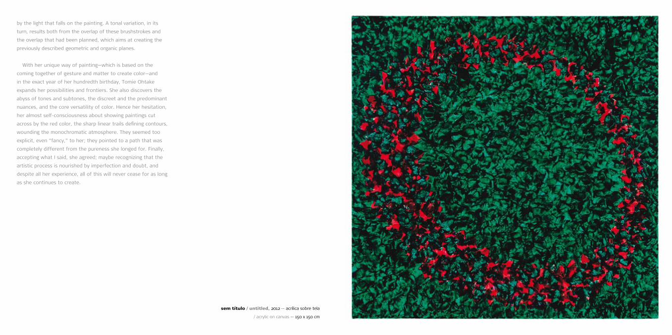
Com seu modo singular de realizar pinturas, pautadas
no amálgama do gesto com matéria para o fabrico da cor,
Tomie Ohtake, justamente no ano em que completa seu
centenário, termina por expandir suas possibilidades e
fronteiras, descobre-lhes os abismos dos tons e subtons,
as nuances discretas e as predominantes, a versatilidade
característica central da cor. Daí sua hesitação, seu
quase pudor em trazer para a exposição as pinturas
atravessadas pelo vermelho, as estridentes trilhas
lineares definindo contornos, ferindo as atmosferas
monocromáticas. Soavam-lhe excessivamente explícitas,
até mesmo “enfeitadas”, apontavam para um rumo que
discrepava da pureza perseguida. Por fim, atendendo
a minha argumentação, concordou. Resignada, talvez,
pela constatação de que o processo artístico alimenta-
se mesmo da imperfeição, da dúvida que, não obstante
toda sua experiência, não cessa e não cessará enquanto
ela seguir produzindo.sem título / untitled, 2012 -- acrílica sobre tela
/ acrylic on canvas -- 175 x 175 cm
sem título / untitled, 2013 -- acrílica sobre tela
/ acrylic on canvas -- 80 x 80 cm
sem título / untitled, 2012 -- acrílica sobre tela
/ acrylic on canvas -- 150 x 150 cm

sem título / untitled, 2012 -- acrílica sobre tela
/ acrylic on canvas -- 100 x 100 cm
sem título / untitled, 2012 -- acrílica sobre tela
/ acrylic on canvas -- 150 x 150 cm
sem título / untitled, 2012 -- acrílica sobre tela
/ acrylic on canvas -- 100 x 100 cm
sem título / untitled, 2012 -- acrílica sobre tela
/ acrylic on canvas -- 125 x 125 cm
sem título / untitled, 2013 -- acrílica sobre tela
/ acrylic on canvas -- 100 x 100 cm


The permanent search for purification and for the
disposal of every superfluous thing, reducing her expression
to what’s essential in order to achieve excellence, is the
main teaching Tomie Ohtake leaves to Brazilian art and to
those who follow her long career with interest—aficionados,
laymen as well as her peers. It is no surprise that a
contribution such as that provided by her work could only be
felt with time, with the consistent exhibition of the series
of paintings, engravings, and, as of the 1970s, sculptures.
When one series is compared to the next, it is possible to
see the rigor with which the artist adjusted and explored
the problems she dealt with. Her systematic handling of
the gesture, color, and matter, which are the fundamental
aspects of her poetics (except for her sculptures, which
are usually monochromatic, made out of metal, and have
homogeneous colors) as well as her constant search
for improving each one of them, never individually, but
through the variation of their weight—for instance, while
one aspect was being modified, the other two were kept
relatively suspended, or the three of them being modified
simultaneously—all of these features progressively revealed
a kaleidoscopic-like game of sorts, a moving texture that
reveals unexpected prisms.
Color, gesture, and matter, not by chance, pervade the
motto of the exhibition Tomie Ohtake – Correspondence,
organized by Paulo Miyada and myself, which will be shown
simultaneously to this one at the cultural center that bears
her name: Instituto Tomie Ohtake. The proof that color,
gesture, and matter are equally important to the large
majority of her contemporary artists is evident when the
artist and fifty-three artists from different generations
are brought together. And the extraordinary quality of her
contribution is evident when one compares the results she
obtained with those of her peers.
For this exhibition at Galeria Nara Roesler, which is
exclusively comprised of never-before-shown works, Tomie
Ohtake, who always aims at perfectioning her technique,
created three sets of paintings after months of continuous
work evaluated by her customary high standards. Each set
focuses on one color, or almost. In two sets she worked
with primary colors—yellow and blue—and in the third set
she used a secondary color, green, which is made by mixing
the other two. The three sets are mostly monochromatic,
except for some green and blue paintings that include red,
i.e., the third primary color. At first, one tends to say that
the red color appears discreetly, as if it were possible.
But that’s not the case, especially when the artist uses
blue and green, which are very intense colors, in the
background. Any amateur knows that the mere contact
between primary and secondary colors using contiguity or,
even worse, juxtaposition, is conflictive.
Although each set of paintings presented in this
exhibition focuses on one color, all three sets have a
common denominator: the same gesture; in other words,
the same short and round brushstroke whose combined
tomie ohtake – painting and purenessagnaldo farias
juxtaposition and overlap produce the same effect, as well as
the same chromatic atmosphere that is ventilated as a relatively
dense fabric, which is nevertheless frayed, revealing something,
or, better yet, attracting the gaze to its interior, inviting it to
explore its depths and to float on the enunciated shapes, giving
itself to the external light that falls on it, on the white portions
of which it is made. These gestures are not driven by chance;
they are not justified by the sheer pleasure of existing as an
aimless action that completes itself. On the contrary, all of
them, which are made in a white quadrilateral—the cloth of the
canvas stretched over a tambour—albeit similar to one another,
have varied formats: triangles, circles, arches, ellipses, squares,
rhombuses, pentagons, different squares, planes that cross
the canvas diagonally, dividing it in two. These planes may be
well defined or blurred, usually sensed rather than noticed, like
unhurried visual rumors, slow as the fish that live at the bottom
of rivers and seas. So, the orderly rhythm of the brushstrokes
that are coordinated to compose geometric and organic figures
becomes a sort of choreography performed on the canvas
plane. These are the traces left by the energy calculated by the
hand that holds the paintbrush while submitted to the struggle
between the forces of reason and desire.
Then, going from general to particular, from the
monochromatic paintings to the cases in which they are
“attacked” by the red color, let’s not focus on the blue, yellow,
or green colors but simply on the color phenomenon. As Tomie
Ohtake explains to us through her paintings, color is never
merely a color, but something that takes place in a body. And
this body may be either dispersed in corpuscles or tangible,
in the form of a dense, tough, and compact matter. When
one thinks only on the paint applied by the artist to the
canvas, it may be more or less viscous, thin or thick, gloss
or flat, transparent or opaque; it may also be classified as
in-between any extreme of one of those pairs. Besides
these possibilities, one must consider the angle at which
light falls on the color applied to the canvas surface, the
amount of light, and, finally, the position of the viewer.
The phenomenon is infinite, since color does not exist as
something abstract, but as something tangible.
The palpability of color is an effect produced by the
solubility of the pigment and, considering the process Tomie
Ohtake uses to create her paintings, it is also owing to
the way the artist, in these three sets, attacks the surface
with the paintbrush. As mentioned before, each canvas is
covered with short and semicircular gestures, produced as if
by a torsion of the wrist. This movement soaks the canvas
when the action begins, when the paintbrush is placed on
it, pressing it; then, it is decompressed while sliding, and it
becomes dense again when the movement ends. Looking
closely, one will notice the trace left by the bristles of the
paintbrush when it moves, the plane composed of parallel
lines, as well as the white irregular thin stripes that separate
them. The entire surface of the canvas is filled with the
same kind of brushstroke and with the same tone of the
chosen color. A fractured mosaic, a sift that, as such, cannot
avoid the luminosity sprouting from the surface, produced
by the light that falls on the painting. A tonal variation, in its
turn, results both from the overlap of these brushstrokes and
the overlap that had been planned, which aims at creating the
previously described geometric and organic planes.
With her unique way of painting—which is based on the
coming together of gesture and matter to create color—and
in the exact year of her hundredth birthday, Tomie Ohtake
expands her possibilities and frontiers. She also discovers the
abyss of tones and subtones, the discreet and the predominant
nuances, and the core versatility of color. Hence her hesitation,
her almost self-consciousness about showing paintings cut
across by the red color, the sharp linear trails defining contours,
wounding the monochromatic atmosphere. They seemed too
explicit, even “fancy,” to her; they pointed to a path that was
completely different from the pureness she longed for. Finally,
accepting what I said, she agreed; maybe recognizing that the
artistic process is nourished by imperfection and doubt, and
despite all her experience, all of this will never cease for as long
as she continues to create.
sem título / untitled, 2012 -- acrílica sobre tela
/ acrylic on canvas -- 150 x 150 cm

avenida europa 655
são paulo sp brasil
01449-001
t 55 (11) 3063 2344
f 55 (11) 3088 0593
www.nararoesler.com.br
abertura/opening
21.02.2013
19 > 22h
exposição/exhibition
22.02 > 23.03.2013
seg/mon > sex/fri 10 > 19h
sáb/sat 11 > 15h
[capa/cover] detalhe de / detail
from sem título / untitled,
2012 -- acrílica sobre tela / acrylic
on canvas -- 200 x 200 cm
curadoria/curator
agnaldo farias
tradução/english version
márcia macêdo
revisão/proofreading
regina stocklen
fotos/photography
everton ballardin
assessoria de imprensa/press agent
agência guanabara
realização/produced by
galeria nara roesler
tomie ohtake
pintura e pureza