Embed Size (px)
DESCRIPTION
Dan Galeria
Citation preview
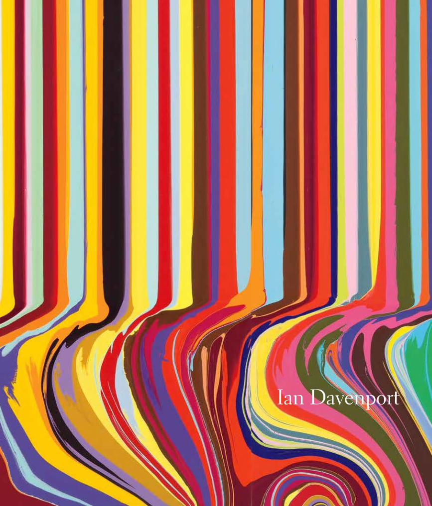
Ian Davenport
1
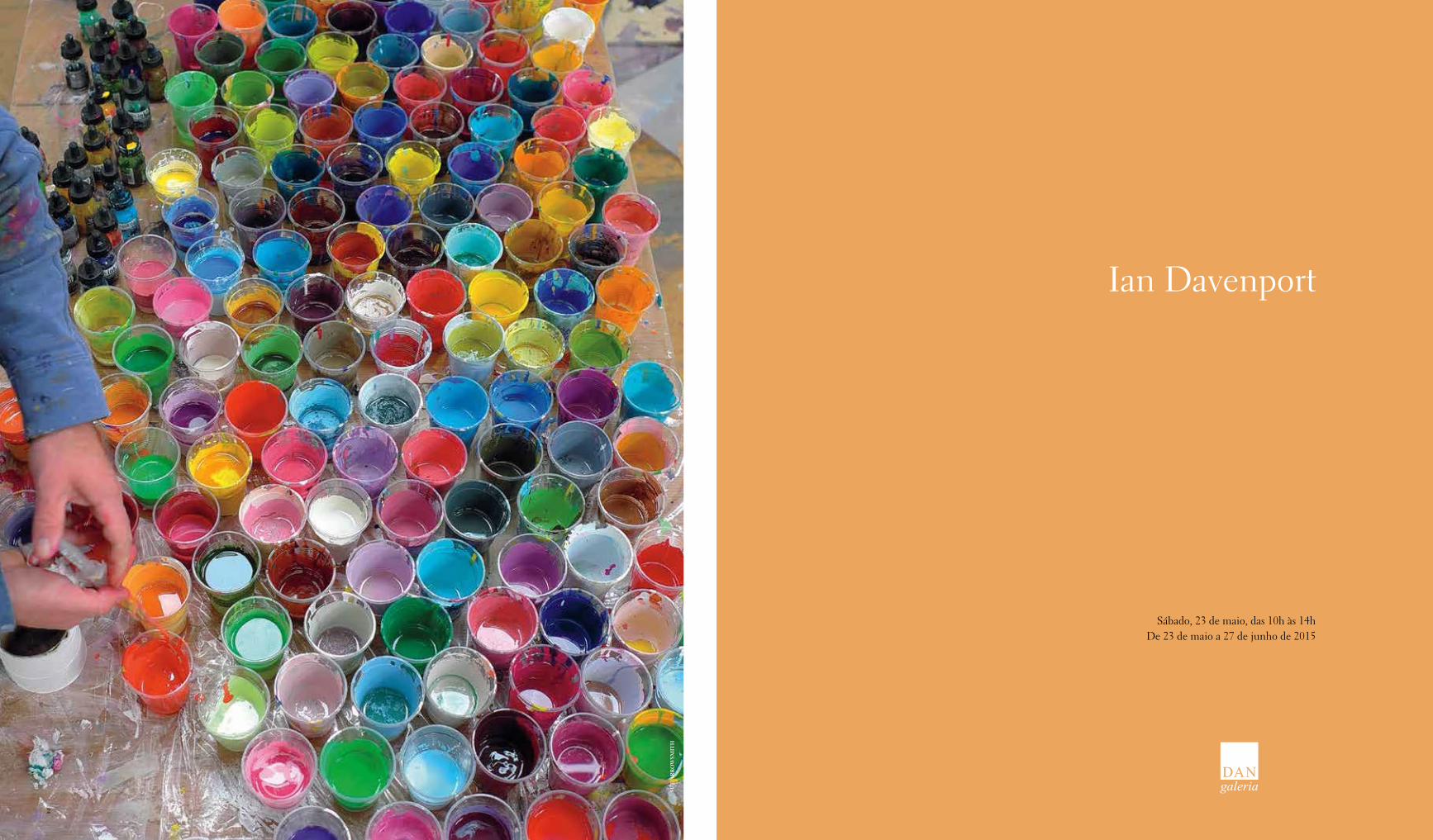
Sábado, 23 de maio, das 10h às 14hDe 23 de maio a 27 de junho de 2015
Ian Davenport
SUE
AR
RO
WSM
ITH
32
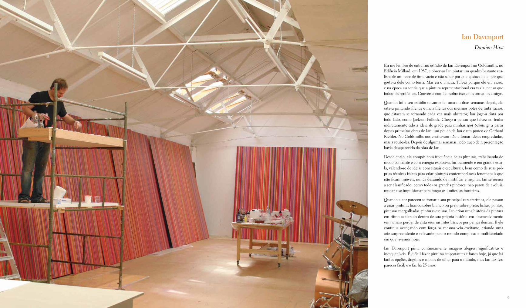
Ian DavenportDamien Hirst Eu me lembro de entrar no estúdio de Ian Davenport no Goldsmiths, no
Edifício Millard, em 1987, e observar Ian pintar um quadro bastante rea-lista de um pote de tinta vazio e não saber por que gostava dele, por que gostava dele como tema. Mas eu o amava. Talvez porque ele era vazio, e na época eu sentia que a pintura representacional era vazia; penso que todos nós sentíamos. Conversei com Ian sobre isso e nos tornamos amigos.
Quando fui a seu estúdio novamente, uma ou duas semanas depois, ele estava pintando fileiras e mais fileiras dos mesmos potes de tinta vazios, que estavam se tornando cada vez mais abstratos; Ian jogava tinta por todo lado, como Jackson Pollock. Chego a pensar que talvez eu tenha indiretamente tido a ideia de grade para minhas spot paintings a partir dessas primeiras obras de Ian, um pouco de Ian e um pouco de Gerhard Richter. No Goldsmiths nos ensinavam não a tomar ideias emprestadas, mas a roubá-las. Depois de algumas semanas, todo traço de representação havia desaparecido da obra de Ian.
Desde então, ele compôs com frequência belas pinturas, trabalhando de modo confiante e com energia explosiva, furiosamente e em grande esca-la, valendo-se de ideias conceituais e esculturais, bem como de suas pró-prias técnicas físicas para criar pinturas contemporâneas fenomenais que não ficam imóveis, nunca deixando de mistificar e inspirar. Ian se recusa a ser classificado; como todos os grandes pintores, não parou de evoluir, mudar e se impulsionar para forçar os limites, as fronteiras.
Quando a cor pareceu se tornar a sua principal característica, ele passou a criar pinturas branco sobre branco ou preto sobre preto; listras, pontos, pinturas mergulhadas, pinturas escuras, Ian criou uma história da pintura em ritmo acelerado dentro de sua própria história em desenvolvimento sem jamais perder de vista seus instintos básicos por pensar demais. E ele continua avançando com força na mesma veia excitante, criando uma arte surpreendente e relevante para o mundo complexo e multifacetado em que vivemos hoje.
Ian Davenport pinta continuamente imagens alegres, significativas e inesquecíveis. É difícil fazer pinturas importantes e fortes hoje, já que há tantas opções, ângulos e modos de olhar para o mundo, mas Ian faz isso parecer fácil, e o faz há 25 anos.
Ian DavenportDamien Hirst
54
SUE
AR
RO
WSM
ITH
“tinta como carne”, como ele próprio dizia —, as superfí-cies cada vez mais esbatidas, densamente encrostadas e es-tranhamente esclerosadas das últimas obras do artista me parecem muito menos realistas e palpavelmente carnosas que o manejo muito mais fluido da tinta típico de seus quadros eroticamente carregados do começo da década de 1970, que respiram bastante com uma sensualidade fácil que posteriormente foi sufocada sob camadas de pigmento aplicadas lenta e obsessivamente por Freud.
Davenport é um desses artistas afortunados cujas habili-dades excepcionais estão plenamente aparentes desde o início. Nascido em 1966 em Sidcup, um bairro no distrito de Bexley, sudeste de Londres, ele começou seus estudos no Northwich College of Art and Design, em Cheshire, em 1984-85, antes de ir para o Goldsmiths, onde recebeu seu bacharelado em Belas-Artes em 1988. No renomado college de Londres ele achava o imensamente influente Craig-Martin “muito desafiador como tutor”, e se recor-da de que “ele tinha um jeito muito direto de falar com a gente”. Uma das lições que lhe ficaram desse tempo é a lembrança do professor admitindo que “não é possível realmente ensinar as pessoas a pintar ou esculpir, mas é possível ensiná-las como olhar”.
Entre os artistas para os quais Davenport diz que olhava com interesse particular durante aqueles anos de forma-ção estavam Jackson Pollock, Jasper Johns e Andy Warhol, e a influência de cada um deles pode ser claramente de-tectada em seu trabalho posterior. O mais evidente de todos em seu impacto na obra de Davenport é o mane-jo revolucionário da tinta de Pollock, com uma entrega aparentemente livre, mas internamente controlada, que se reflete nas tecnicamente consumadas “Puddle Paintings” do artista britânico, de 2008, e adiante.
A claridade icônica da obra de Johns das décadas de 1950 e 1960 se reflete em Davenport no manuseio achatado, diagramático de motivos como o túnel arqueado que apa-rece em suas pinturas derramadas em grande escala no finzinho do milênio (embora o revivescimento por Johns da antiga técnica da encáustica, um processo lento e es-merado, seja bem o oposto da aplicação ligeira por Daven-port de tinta muito líquida). Além disso, a apropriação por Davenport de um padrão de cortina de janela listrada, que ele viu uma vez em uma loja londrina de kebab, tem um paralelo na adaptação similar por Johns de seus motivos gradeados e de formas irregulares da década de 1970, que ele observou por acaso pintados em vitrines de partes mais
pobres da cidade de Nova York — em ambos os casos, exemplos clássicos do vernáculo urbano contemporâneo exercendo um efeito direto na arte elevada.
Seria difícil encontrar atualmente um artista de vanguarda que não tenha sido influenciado por Warhol, e devemos acreditar no que Davenport diz, embora sua própria obra não exiba a maior parte dos tropos clássicos de Warhol, em especial a borradura pelo mestre americano dos limites en-tre pintura e fotografia. Por outro lado, as “Pinturas Rever-sas” em grande escala de Davenport por volta da virada do milênio se relacionam com a “Série Reversa” de Warhol do fim da década de 1970 e da década de 1980, se bem que não diretamente, pois, ao passo que a sequência do ameri-cano revisitava obras familiares dele da década de 1960 e as reiterava em um formato que evocava negativos de fotogra-fias, as “Reversas” de Davenport tomavam um motivo novo para ele e o apresentavam em inversões de cor lado a lado. (Pode-se acrescentar que, em termos de tonalidades cromá-ticas, Davenport em várias séries seguiu outro exemplo de Warhol ao apresentar sequencialmente a mesma imagem em muitas combinações de cores, como o americano fez em suas séries de Marilyn e Mao, entre outras.)
Além desses pintores, Davenport também destacou uma influência específica entre compositores modernos: John Cage, o pioneiro experimental de novas formas radicais de música e um colaborador íntimo de artistas com opiniões semelhantes como Johns e Rauschenberg, entre outros. Davenport vê o que chama de “um paralelo muito forte” entre a qualidade rítmica expressa de maneiras diferentes por muitas de suas pinturas e seu interesse em música: na verdade ele toca bateria em uma banda de rock, um hobby que tem um significado mais que passageiro em termos de sua sensibilidade pinturesca. É claro que essa não seria a primeira vez que um pintor moderno explora ideias em música que em seguida chegam a seus quadros, sendo o caso mais notável talvez o de Piet Mondrian, cujas pin-turas “Boogie Woogie” do final da carreira, na década de 1940, expressavam os mesmos ritmos em staccato que ele encontrou nessa nova variante epônima de jazz que era tocada nos clubes noturnos de Nova York na época.
Embora Davenport tenha passado por fases estilísticas dis-tintas ao longo de sua carreira, a qualidade que une todo o corpo de sua obra é uma simplicidade preponderante, mesmo em obras posteriores nas quais ele desenvolve cer-tos temas com complexidade crescente, como em suas “Puddle Paintings”, que usam e expandem a série “Poured
Ian Davenport — o pintor que é mais conhecido como um dos chamados Young British Artists, o grupo de jo-vens inovadores (composto por Michael Landy, Damien Hirst, Gary Hume, Fiona Rae e Sam Taylor, entre outros) que foram formados no Goldsmiths College de Londres por instrutores célebres como Jon Thompson e Michael Craig-Martin durante a década de 1980, rapidamente ga-nharam aplausos da crítica e aceitação do público no co-meço da década de 1990, e infundiram vida nova na cena da arte contemporânea internacional no fim do milênio — já pode contemplar uma carreira que se divide em fases prontamente definíveis e internamente coesas, que lem-bram os distintos períodos de grandes mestres do século XX, como Picasso, Braque e Matisse.
Agraciado com uma exposição individual numa galeria de Londres aos 24 anos, apenas dois anos depois de ter saído da escola de arte — um evento precoce que foi a primeira de suas mais de quarenta mostras, além das várias exposi-ções coletivas na Europa, na Ásia e nos Estados Unidos desde 1985 —, Davenport vem desfrutando de uma signi-ficativa exposição pública por mais da metade da sua vida.
Talvez porque o sucesso veio tão cedo para ele, Davenport não se apegou a formatos pictóricos específicos além do ponto em que ele os julgava exauridos de novos desen-volvimentos, ao contrário de alguns artistas, que a certa altura da carreira encontram uma fórmula comercialmen-te aprovada que eles continuam a garimpar, muitas vezes com reduzida eficácia, desde que ela encontre um públi-co receptivo.
Apesar dos repetidos deslocamentos de Davenport de um formato visual para outro, a qualidade unificadora que subjaz toda a sua variada produção é um amor profun-do e permanente pela tinta como seu material essencial, combinado a um entendimento quase sobrenatural das propriedades físicas inatas e das características técnicas de seu meio preferido. Isso pode soar como uma reafirmação do óbvio — qual pintor, pode-se perguntar, não compre-ende plenamente as propriedades físicas de seu meio? —, mas, de fato, uma empatia inata com qualquer material não deve ser automaticamente dada como certa em ne-nhum artista, mesmo o mais demonstravelmente pintures-co [painterly] dos pintores.
Por exemplo, embora Lucien Freud fosse amplamente louvado pela maneira como manuseava o pigmento para representar seus célebres nus de modo mais naturalista —
Música para os olhos: a arte de Ian Davenport
Martin Filler
76
Lines” , que as antecedeu. O modo como se pode dizer que o tema de Davenport evoluiu de suas técnicas de fa-bricação é resumido em uma observação do próprio artis-ta: “O como pintar se tornou o que pintar”.
A relação estreita entre essas duas considerações na obra de Davenport evita o dilema proposto pela segunda parte da equação, algo que atormentou artistas modernos am-plamente libertos das considerações de comissões oficiais e patrocínio privado que até o século XIX costumeiramen-te determinavam a escolha dos temas. Como diz Daven-port: “A pureza absoluta pode ser muito preocupada con-sigo mesma”.
No entanto, a liberdade dada a artistas visuais uma vez que eles não mais tinham a obrigação de atender unicamente aos caprichos de príncipes, prelados e potentados — uma mudança tornada possível pelo surgimento de um merca-do de arte inicialmente alimentado por colecionadores não aristocratas na Holanda do século XVII — acabou levando pintores com inclinação representacional da metade do século XX a uma crise criativa sobre tema, especialmente depois que a abstração se tornou o modo da vanguarda internacional aceito no pós-guerra. Um exemplo clássico desse dilema foi Warhol, que era conhecido por implorar àqueles que o cercavam por ideias sobre o que pintar a se-guir, o que produzia resultados que variavam loucamente, dependendo de quem ele interpelava. Mas, mesmo entre os abstracionistas, essa independência em encontrar o pró-prio caminho em termos de o que — que para Davenport é um fruto de sua convicção de que método e significado devem ser a mesma coisa — é particularmente notável.
Além dos inspiradores mestres que teve no Goldsmiths, outra forte influência sobre Davenport foi a biblioteca do college, com toda a gama de periódicos sobre arte que ela oferecia, que ele acompanhava avidamente e que lhe per-mitiram manter-se a par de desenvolvimentos internacio-nais, além da atmosfera fortemente carregada do que hoje em geral se considera ter sido um dos principais epicen-tros da educação em arte do século XX. No verão de 1988, pouco depois de ter se graduado no Goldsmiths, Daven-port foi uma das dezesseis figuras emergentes incluídas na inovadora exposição coletiva Freeze, que teve como cura-dor Damien Hirst e foi realizada em um prédio abandona-do da London Port Authority, nas docas da cidade, no lado sul do Tâmisa, um evento seminal para o amplo reconhe-cimento daqueles que rapidamente ficariam conhecidos como os Young British Artists, ou YBAs.
8
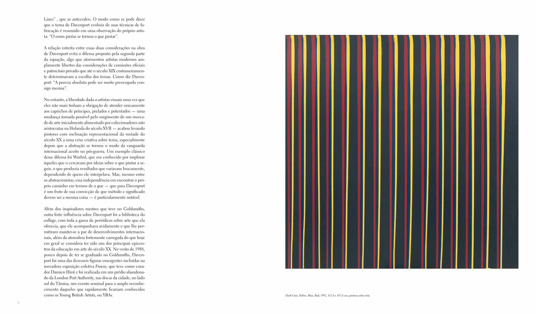
Dark Grey, Yellow, Blue, Red, 1992, 167,6 x 167,6 cm, pintura sobre tela
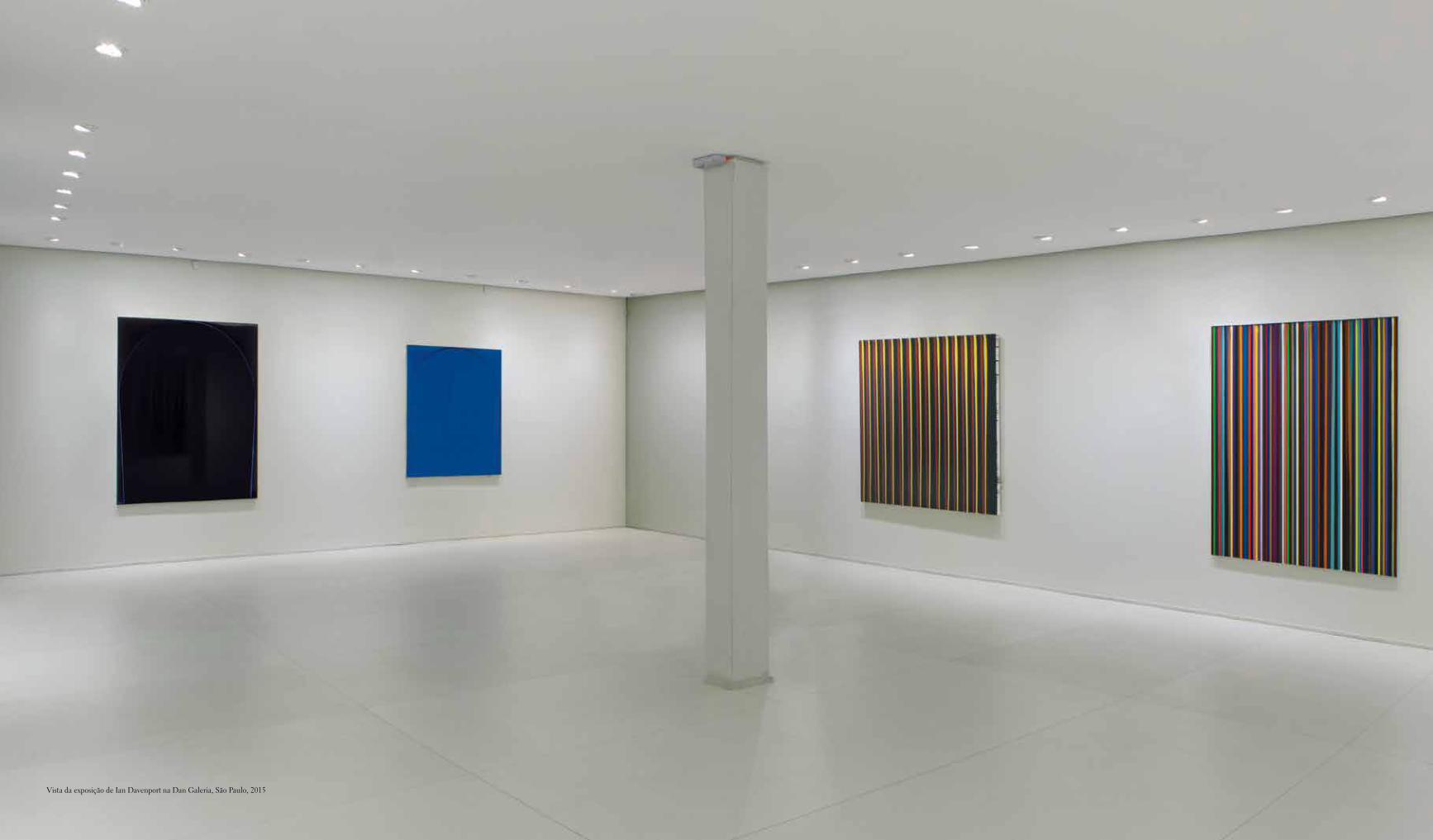
Vista da exposição de Ian Davenport na Dan Galeria, São Paulo, 2015
12
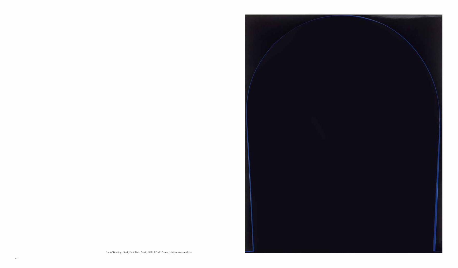
Poured Painting: Black, Dark Blue, Black, 1998, 183 x152,4 cm, pintura sobre madeira
1514
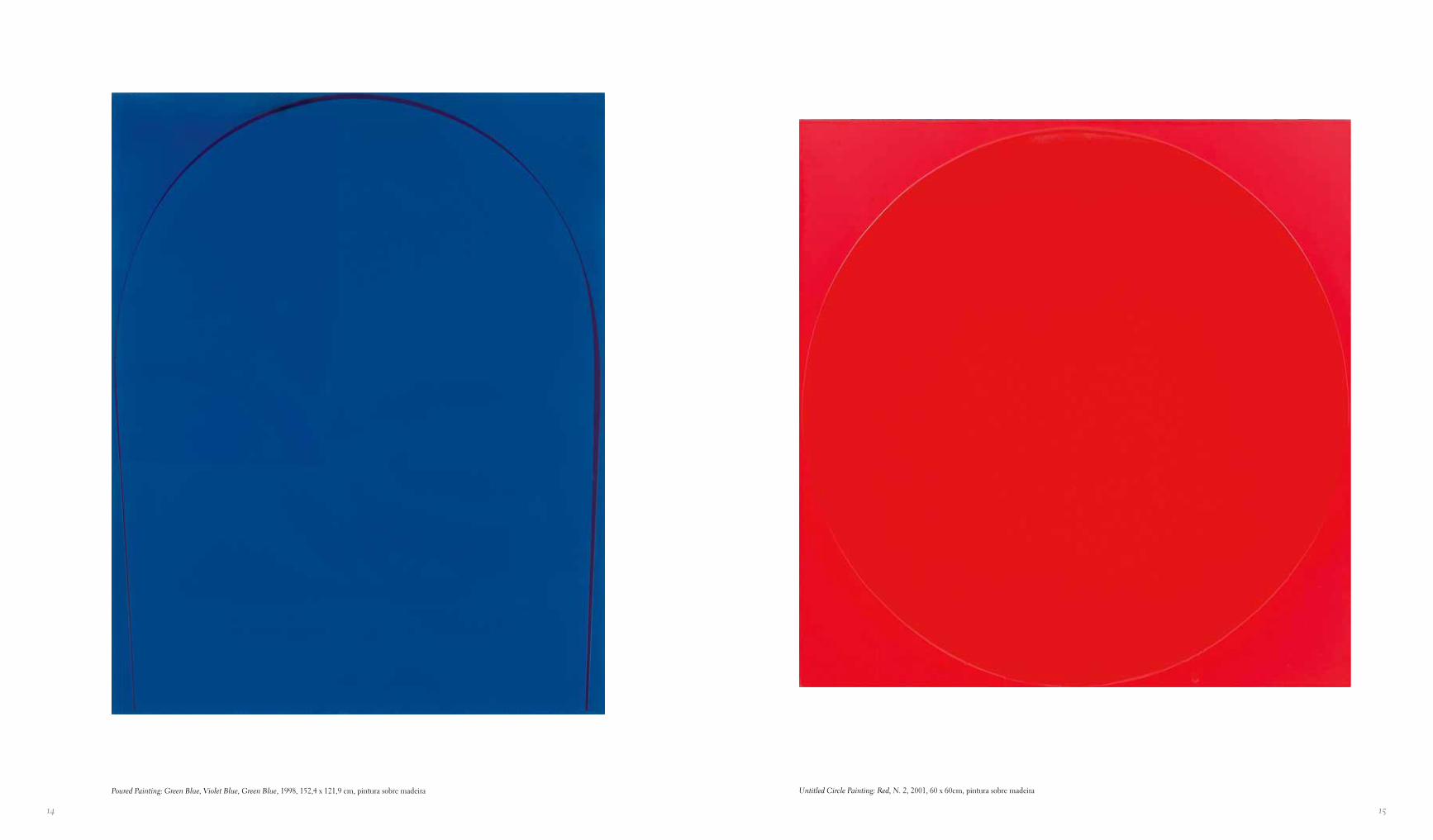
Untitled Circle Painting: Red, N. 2, 2001, 60 x 60cm, pintura sobre madeiraPoured Painting: Green Blue, Violet Blue, Green Blue, 1998, 152,4 x 121,9 cm, pintura sobre madeira
1716
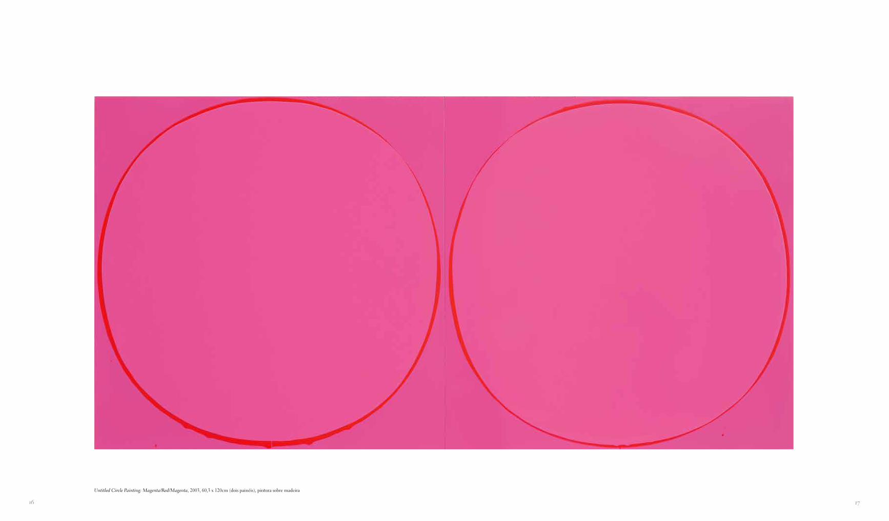
Untitled Circle Painting: Magenta/Red/Magenta, 2003, 60,3 x 120cm (dois painéis), pintura sobre madeira
1918
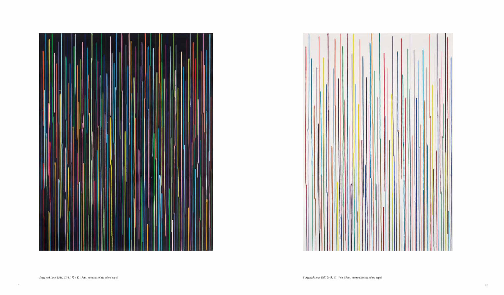
Staggered Lines-Trill, 2013, 101,5 x 68,5cm, pintura acrílica sobre papelStaggered Lines-Ride, 2014, 152 x 121,5cm, pintura acrílica sobre papel
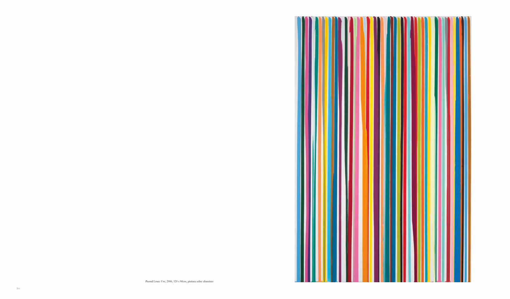
Poured Lines: Uni, 2006, 120 x 80cm, pintura sobre alumínio
20
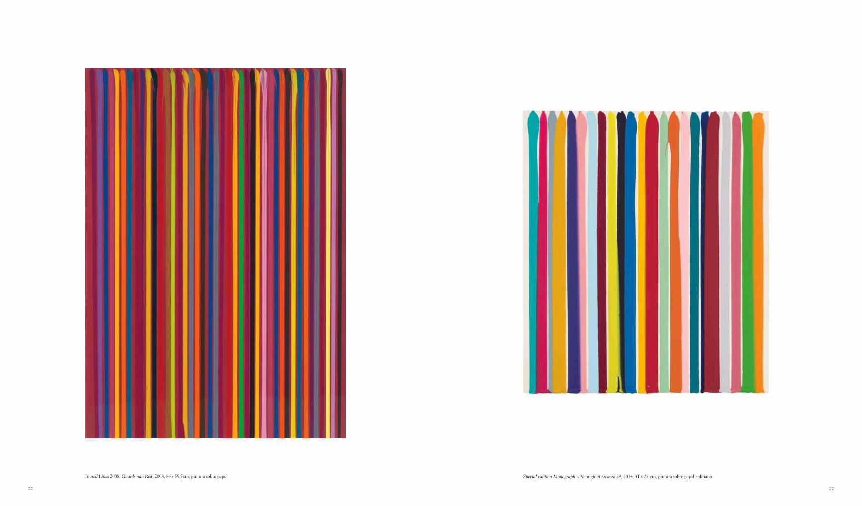
Special Edition Monograph with original Artwork 24, 2014, 31 x 27 cm, pintura sobre papel FabrianoPoured Lines 2008: Guardsman Red, 2008, 84 x 59,5cm, pintura sobre papel
2322
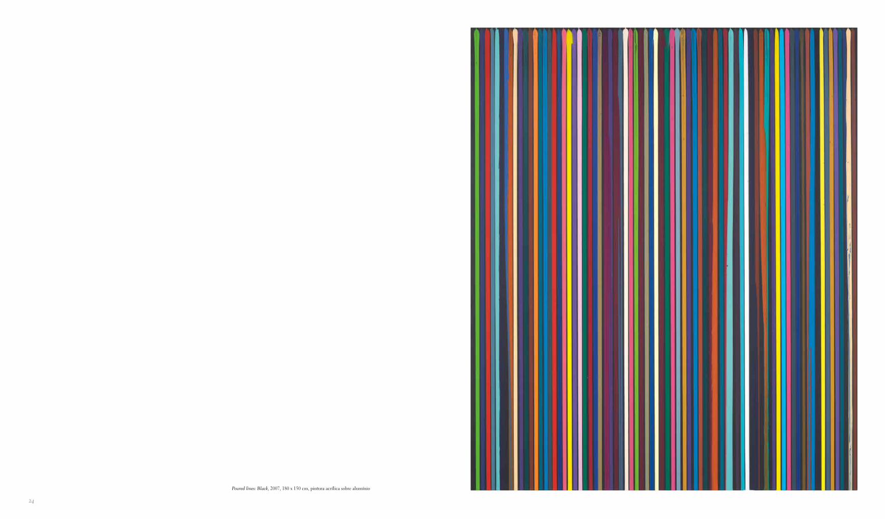
Poured lines: Black, 2007, 180 x 150 cm, pintura acrílica sobre alumínio
24
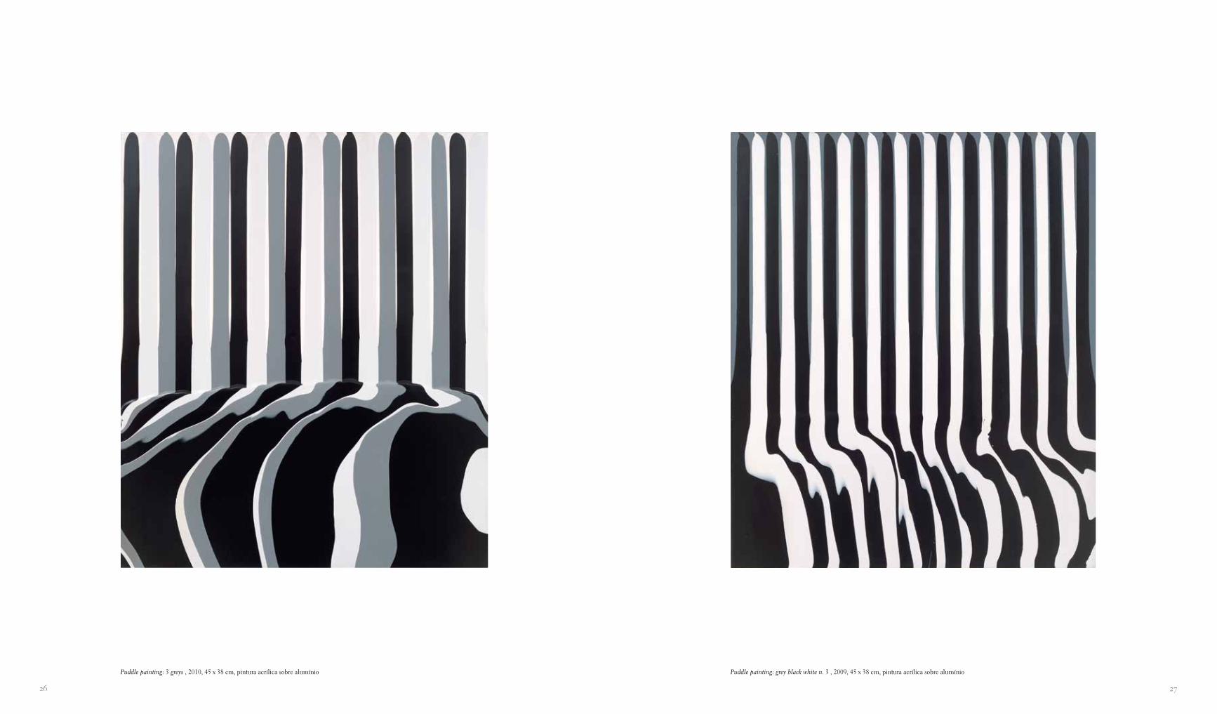
Puddle painting: grey black white n. 3 , 2009, 45 x 38 cm, pintura acrílica sobre alumínioPuddle painting: 3 greys , 2010, 45 x 38 cm, pintura acrílica sobre alumínio
2726
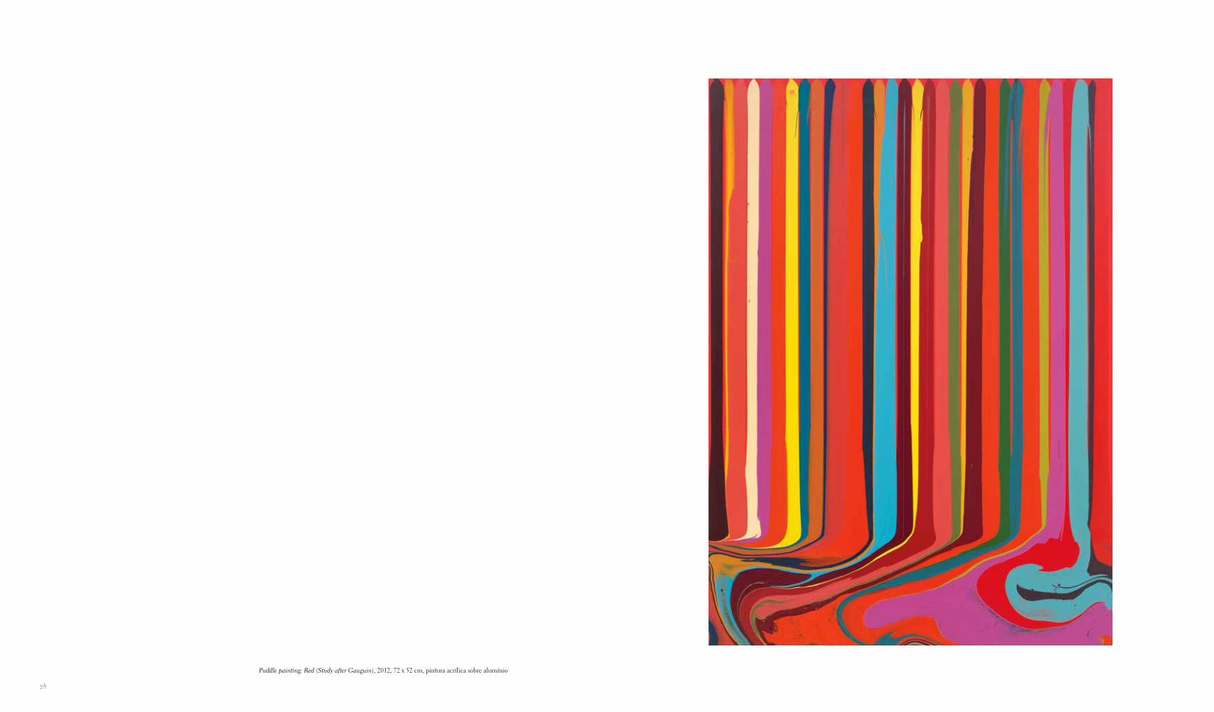
Puddle painting: Red (Study after Gauguin), 2012, 72 x 52 cm, pintura acrílica sobre alumínio
28
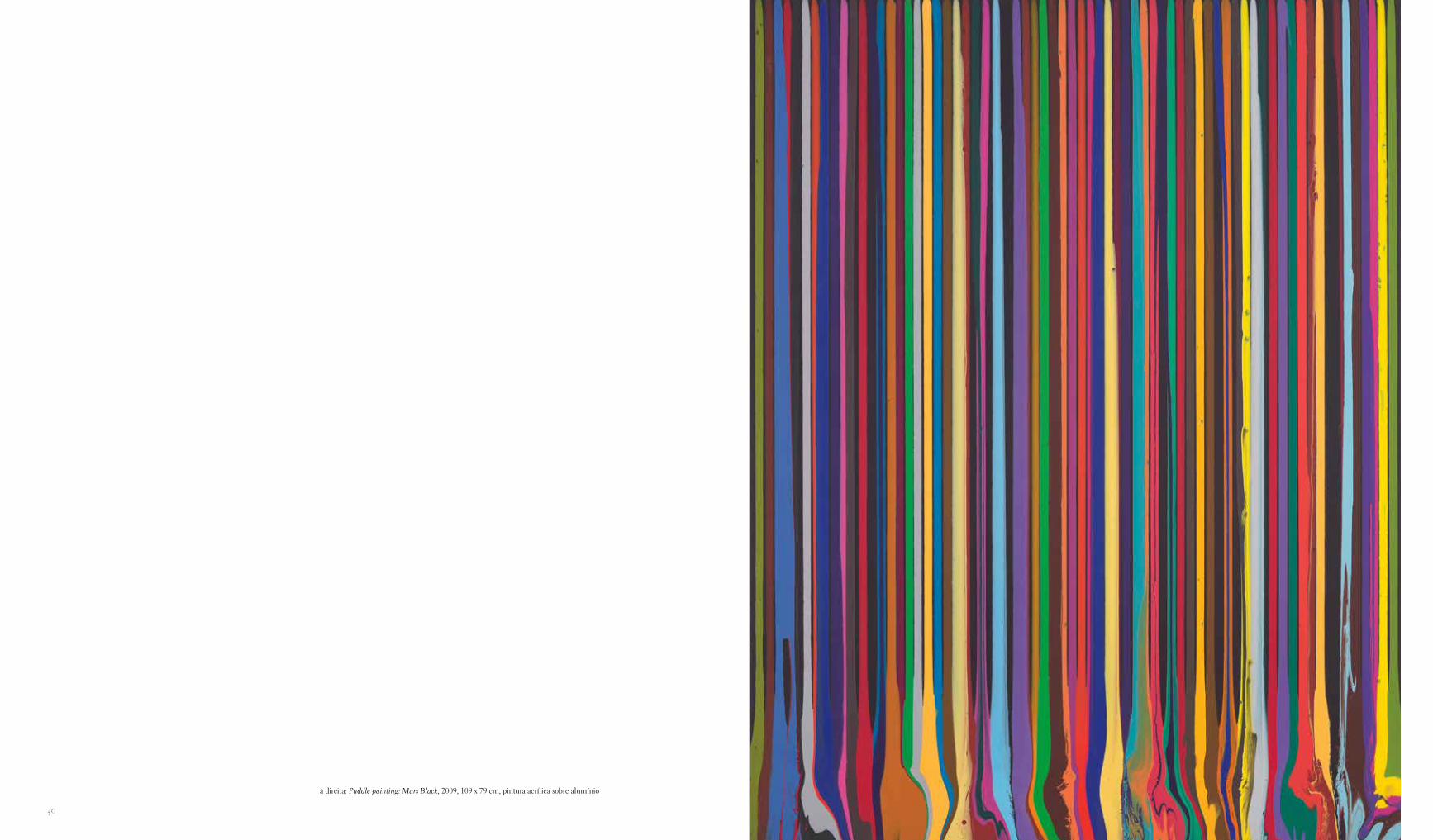
à direita: Puddle painting: Mars Black, 2009, 109 x 79 cm, pintura acrílica sobre alumínio
30
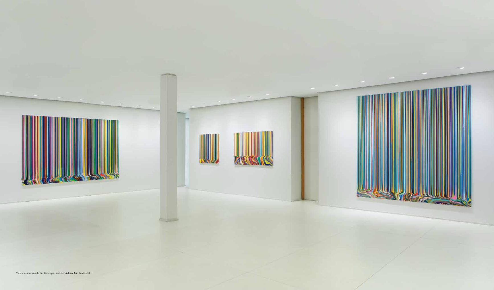
Vista da exposição de Ian Davenport na Dan Galeria, São Paulo, 2015
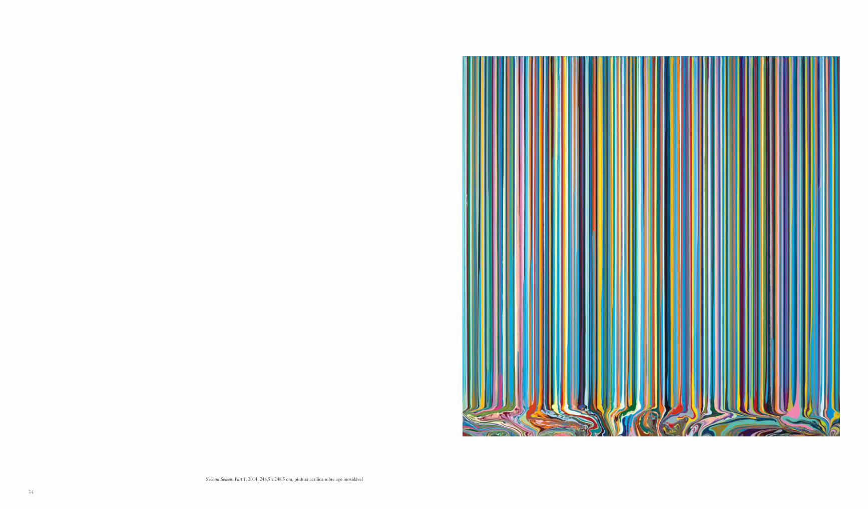
Second Season Part 1, 2014, 248,5 x 248,5 cm, pintura acrílica sobre aço inoxidável
34
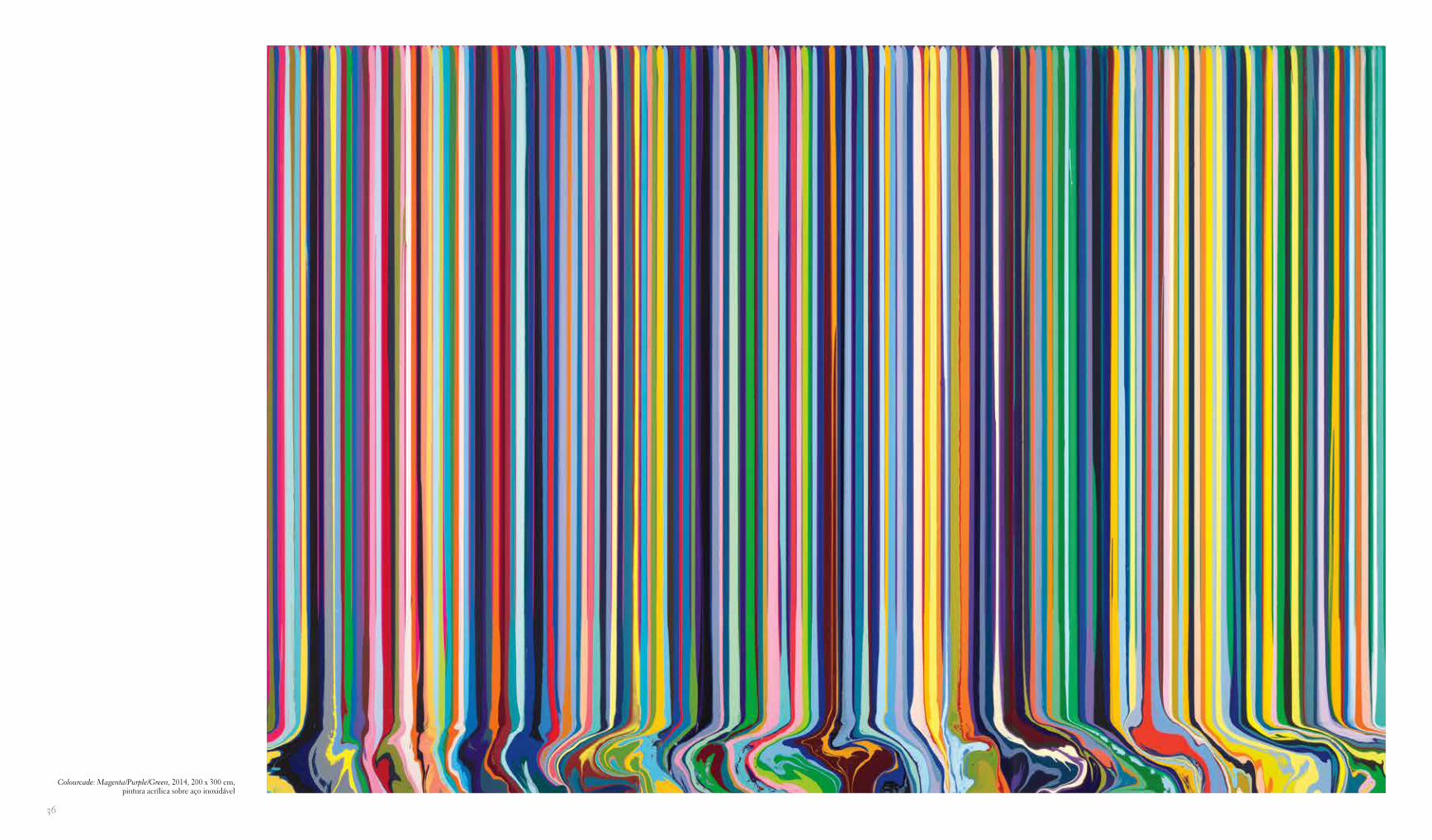
Colourcade: Magenta/Purple/Green, 2014, 200 x 300 cm, pintura acrílica sobre aço inoxidável
36
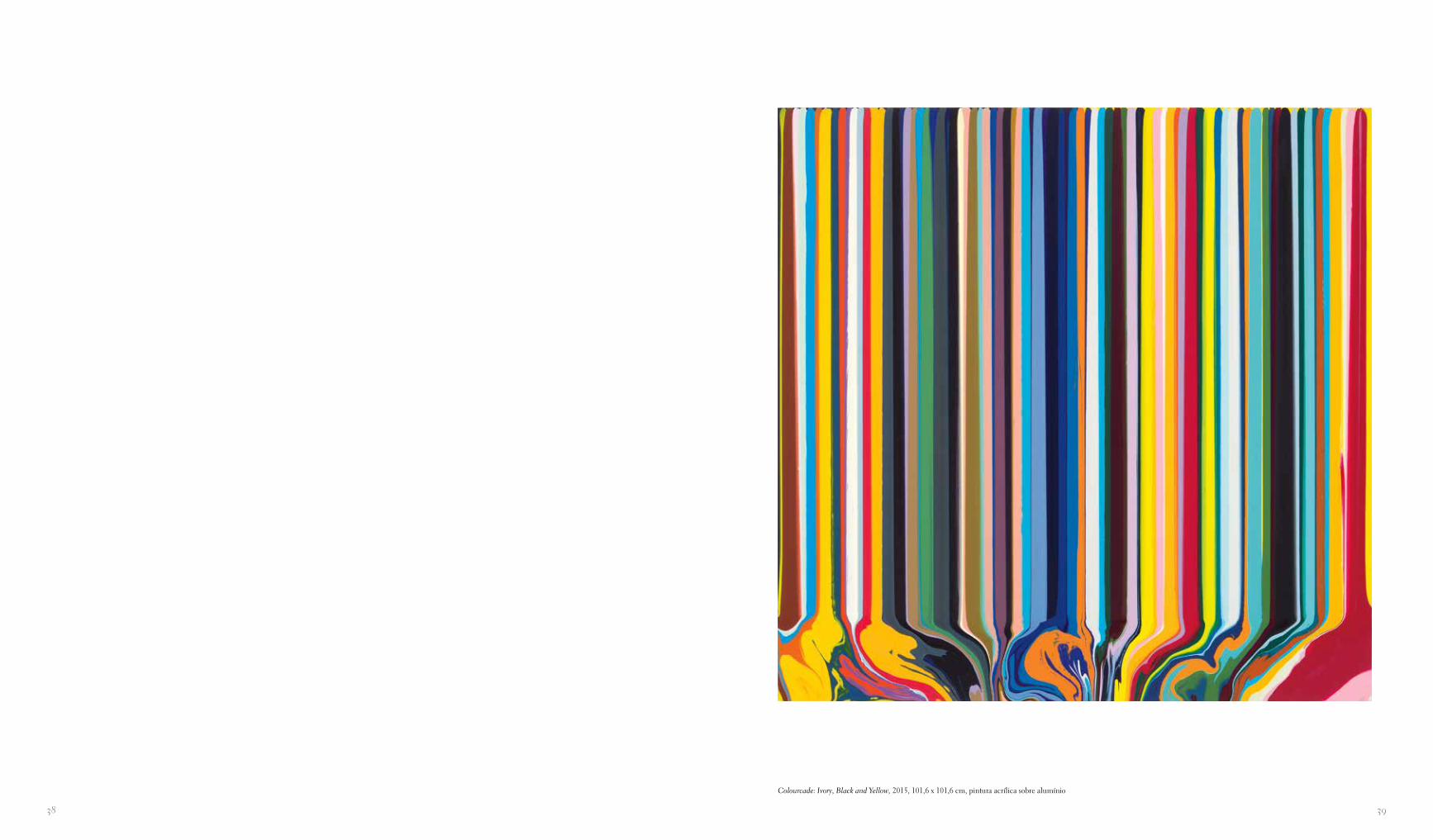
Colourcade: Ivory, Black and Yellow, 2015, 101,6 x 101,6 cm, pintura acrílica sobre alumínio
3938
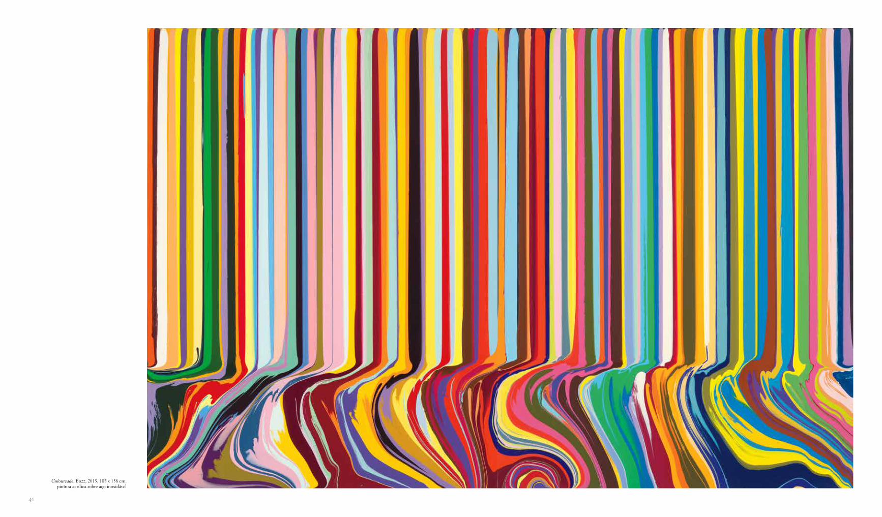
Colourcade: Buzz, 2015, 103 x 158 cm, pintura acrílica sobre aço inoxidável
40
4342
mente eu não conseguia entender aquilo, e retomei a ideia vários anos depois.
mb Como você acabou resolvendo o problema?id Às vezes as ideias mais simples são aquelas que levam mais tempo para realizar. Demorou alguns anos para eu perceber que, para derramar uma quantidade tão grande de tinta, a su-perfície preparada tem de ser muito regular e totalmente plana, e para alcançar isso eu comecei a trabalhar sobre painéis.
mb O que você estava fazendo no meio-tempo?id Eu imaginava se poderia juntar dois grupos de pinturas an-teriores de modo que eles tivessem um ritmo pulsante e tam-bém fossem redutivos. Minha mulher, Sue, tinha me pedido que eu regasse o jardim e eu estava brincando com o regador. Pensei, hmm, há alguma coisa aqui… Eu sabia de uma pintu-ra de Jasper Johns chamada Device [Dispositivo] e era hora de introduzir outro “dispositivo” em meu estúdio. Regadores são projetados para controlar o fluxo de líquidos, e descobri que conseguia fazer carreiras de linhas gotejadas usando um deles. Dois anos depois, em minha mostra seguinte na Waddington, as gotas tinham se alongado em listras. Esse foi o primeiro grupo de “listras”. Meu estúdio na época era cercado de ferro corru-gado, que eu observava. Até certo ponto essas obras imitam o ferro corrugado, algumas delas eram foscas e brilhantes, mono-cromáticas, refinadas. Então imaginei o que aconteceria se eu começasse a brincar com cor e quisesse me surpreender.
mb Isso parece nos levar de volta ao elemento “ridículo” em sua prática.
id Bem, eu estava sempre procurando uma máquina que pu-desse fazer minhas pinturas, e encontrei uma — sou eu! Há um equilíbrio entre o mecânico e um toque humano, afetuoso. Warhol entendia que as coisas que davam “errado” em seu tra-balho eram o que o tornava tão interessante. Na série de pin-turas “Homens Mais Procurados”, por exemplo, seu assistente havia serigrafado todas um pouco deslocadas, e elas estavam fora de registro. Warhol naturalmente adotou isso, entendendo intuitivamente que coisas que saíam levemente defeituosas lhe davam uma vantagem. Do mesmo jeito que acontece quando você grava música em um sistema de gravação digital e está tudo perfeitamente no tempo e ela de algum modo perde algo. A questão é como você equilibra rigor com falibilidade huma-na e, mais especificamente, em meu caso, a natureza orgânica da tinta.
mb Isso é o equivalente na história da arte ao momento interes-sante em música em que você consegue uma hibridização de estilos aparentemente opostos — o momento em que Can ou Roxy Music ocorrem, reunindo abordagens que não deveriam realmente funcionar.
id Mas eles são ótimos.
mb Você acha que a computação pode se tornar cada vez mais importante para o que você faz?
mb Isso estabelece uma qualidade que foi um fascínio cons-tante em você, que é, na falta de uma palavra melhor, uma espécie de abordagem à la Heath Robinson [cartunista inglês conhecido por desenhar máquinas absurdamente complicadas para executar tarefas simples] de construir geringonças para fa-zer pinturas levemente excêntricas. Mas não há absolutamente nenhuma ironia nisso…
id Não, de forma alguma. Há um pouco de humor, e também uma espécie de seriedade. Por exemplo, Brice Marden fez al-gumas pinturas em que ele amarrava um pincel em um bastão. Ele descobriu que era muito bom em fazer pinturas apenas com o punho, e queria “desaprender” a familiaridade de seus gestos. Matisse notoriamente fez muitas pinturas em que amarrava um pincel na ponta de uma vara e pintava à distância de um braço, de novo, pela mesma razão. Para perder talvez parte de seu sa-ber, sua memória muscular…
mb Nesse momento você teria admirado Automobile Tire Print (1953), de Cage e Rauschenberg?
id Eu estava lendo sobre essas pessoas e tinha uma relação mui-to forte com elas. Muito mais do que com as coisas que estavam acontecendo na Inglaterra.
mb Em termos geracionais, como artista, você foi confronta-do com o problema de como lidar com o pós-modernismo. Os pintores do New Image escocês da metade da década de 1980 tinham feito aquelas grandes pinturas históricas pós-modernas, literárias, românticas — sobre ansiedade e comédia, pastelão e conflito. Mas para você, como parte da geração seguinte, era preciso ir além da “inteligência” desse jogo pós-modernista com estilo. Então você volta à pintura com um bastão grosseiro, um prego ou algo do tipo…
id Exatamente, algo muito cru: usando tintas Dulux foscas e brilhantes. O “cotidiano” era um tema fundamental. As tintas faça-você-mesmo que eu usava eram muito baratas, então você podia comprar baldes e baldes pelo mesmo preço de uma lati-nha de tinta a óleo. Quando você começa a derramar enormes baldes de tintas brilhantes, o fato de elas serem baratas é uma boa coisa!
mb Seu pensamento começava com a reprise da intervenção do acaso, no sentido de John Cage? Há a intervenção do acaso, à la Cage, e então você acrescenta uma pequena borrifada de Jacques Tati ou algo assim. Isso é justo?
id Sim. Às vezes há um leve ridículo na abordagem, o que me faz rir quando começo alguma coisa. Muitas das ideias que funcionaram para mim normalmente eram bem bobas. Uma abordagem de homem das cavernas realmente estúpi-da da pintura — eu suponho que estou tentando descrever uma espécie de “estupidez”. Eu tinha feito uma série de pin-turas pretas muito mínimas e as pessoas diziam: “Você reduziu tanto tudo, como vai conseguir simplificar isso?”. Eu soube imediatamente que a coisa mais fácil de fazer era uma grande forma derramada — a maior gota da história! Eu tentei, mas não consegui imaginar uma maneira de fazer isso. Tecnica-
Conversa com
Ian Davenport
Michael BracewellLondres, junho de 2013
michael bracewell Eu imagino que muitos artistas são cau-telosos em falar tão diretamente sobre o que fazem. Enterrada em algum lugar nos cadernos de Brian Eno, há esta frase: “Que o mistério seja suficiente”.
ian davenport Essa é uma maneira muito boa de dizer isso. Eu sou um pouco precavido contra ser definido por declarações específicas.
mb Eu me lembro que, quando nos falamos da última vez, a certa altura você disse: “Eu sou muito bom em derramar tinta”. Você sustentaria essa declaração simples, mas muito envolvente?
id Eu percebo que em outras entrevistas, quando a conversa está mudando de rumo e se tornando um pouquinho ambígua demais, é bom pô-la no chão e dizer algo bastante simples e sensato. O que eu tento fazer é equilibrar uma habilidade física com outros aspectos menos tangíveis. Eu sempre fiquei intrigado com materiais. Quando eu era muito jovem, na escola, tentei até misturar cola na tinta. Sempre me diziam para eu não fazer isso porque não seria possível tirar a tinta da paleta! Então, desde o início eu gostava de explorar a pintura desse ponto de vista.
mb Portanto, pintar em termos de textura real?id … da materialidade da textura, sim. Eu imagino que todo artista embarca numa pequena jornada. No college eu me dei conta de que parte de minha jornada era explorar o trabalho com materiais e o que eu podia fazer com eles. Olhando para trás, ao longo de vinte e poucos anos, me parece que eu en-contro uma área específica na qual me concentrar e depois a investigo exaustivamente. Em seguida faço um novo grupo de obras que têm as mesmas ideias básicas por trás delas, mas visu-almente são bastante diferentes. No entanto, os mesmos princí-pios orientadores estão lá: a obra é muito guiada pelo processo e, fundamentalmente, usa a gravidade para dirigir o fluxo de tinta. Se eu olho para uma pintura que fiz há vinte anos, ela se acomoda muito confortavelmente com algo que estou fazendo hoje. Penso que isso é verdade sobre muitos artistas, você nem sequer percebe que o está fazendo. Eles tendem a ter áreas--chave para as quais querem olhar: isso é algo muito intrínseco a quem você é como pessoa. Eu não tinha ideia de que podia fazer certas coisas com tinta que outras pessoas realmente acha-riam muito difícil. Isso me foi apontado durante um tutorial.
mb O Goldsmiths obviamente teve um efeito profundo em você.
id Enorme. Primeiro eu fiz um curso preparatório no North-wich, onde experimentei muitas coisas. Eu queria ir para o Gold-
smiths com uma mente muito aberta. Em meu primeiro ano, mudei para uma sala onde as pessoas faziam não só pintura, mas também escultura. Eu estava pintando figurativamente mas, de novo, tinha muito mais a ver com movimento, cor, superfície e textura. Havia um senso de figuração, mas era bastante sutil.
mb Quais eram seus pontos de referência?id Eu realmente olhava para tudo. Frank Auerbach, Lucien Freud, todas as coisas que um estudante britânico de dezoito a dezenove anos faria na época. Comecei gradativamente a olhar para a história da arte em um sentido muito mais amplo — mais internacional… Julian Schnabel e a própria pintura ex-pressionista que ocorria então. Em meu segundo ano, fiz uma pintura da qual fiquei muito orgulhoso. Era como uma ode à Cadbury com o chocolate meio que se desfazendo em uma grade. Eu me lembro de ter um debate com Richard Wentwor-th sobre ela. Ele insistia que era uma grade modernista, mas eu insistia que era chocolate. O que a tornava interessante era que ela era as duas coisas. Quando você é um estudante de arte com saudade de casa e sente fome, o chocolate significa algo muito poderoso. Então, em meu terceiro ano, comecei a me perguntar: o que eu pinto? A questão fundamental para um pintor! O que você pinta? Eu estava sentado em meu estúdio cercado por potes de tinta e aquilo se tornou o tema. Talvez essa seja minha “história de criação”; certamente aquele se tor-nou um momento especial. Quando pintava aqueles potes de tinta eu usava gestos mais rápidos e mais econômicos, o que significava que eu era capaz de deixar a tinta gotejar, imitando as gotas nas laterais dos potes. Ao longo de algumas semanas eu descobri que eram as gotas que eu achava interessantes. Isso se referia à conversa que eu tivera com alguém antes sobre minha investigação de materiais.
mb Quem o influenciava?id Quando estava no college, eu tinha muito interesse em Warhol e Pollock. Achava que eles eram dois grandes artistas, e na época eles eram os que mais me intrigavam, e ainda intrigam. Depois que eu saí do college, não tinha muito dinheiro, então tentei fazer algumas pinturas em que quase não havia tinta na tela — essas seriam as pinturas mais econômicas que se poderia fazer como artista. Eu tinha um potinho de tinta e uma tela muito grande, enorme, e pensava, tudo bem, vou ver se consigo esticar isso ao máximo. Então eu fiz uma pintura de seis metros e meio com um potinho de tinta, com umas gotas muito bonitas ao longo dela, com uma marca de registro no topo. Mas basica-mente eu só estava mergulhando um prego numa lata de tinta e depois fazendo uma marca no topo pensando, quão rapidamen-te eu consigo fazer uma pintura? Posso fazer isso e sair impune?
mb Mas há mais nisso, não? Fazer uma pintura com um pre-go num bastão, mergulhado na tinta… Você estava conscien-temente tentando desmantelar o tipo de intelectualismo que historicamente acompanhara a abstração?
id Sim, apesar de que eu jamais expressaria isso assim. Parecia libertador e eu simplesmente seguia minha intuição.
4544
1966 Nasce em 8 de julho em Kent, Inglaterra.
1984-85 Cursa o Northwich College of Art and Design, Cheshire.
1985-88 Bacharela-se em Belas-Artes no Goldsmiths College of Art, Londres.
1991 É indicado para o Prêmio Turner.
1996-97 Comissionado para criar uma instalação site-specific para o Banque BNP Paribas em Londres.
1999 Ganha o Prêmio John Moores da Liverpool Exhibition 21.
2000 Ganha o Premio del Golfo, La Spezia, Itália.
2002 Ganha o primeiro prêmio Prospects (patrocinado pela Pizza Express), Essor Project Space, Londres.
2003 Faz um mural para o Groucho Club, Londres.
2004 Comissionado pela Contemporary Art Society para fazer um mural para o Institute of Mathematics and Statistics, na Warwick University, intitulado Everything. • Abertura de retrospectiva em Ikon, Birmingham, em setembro. • Casa-se com Sue Arrowsmith.
2006 Produz Poured Lines: Southwark Street, uma pintura de 3 x 48 metros comissionada por Southwark Council and Land Securi-ties como parte de um projeto de regeneração em Bankside, Lon-dres, instalada sob a Western Bridge, Southwark Street, Londres. • Comissionado para desenhar uma capa em edição limitada para o número de setembro da revista Wallpaper.
2007 Comissionado pela The New York Times Magazine para criar uma bandeira americana baseada em um tema ambientalmente amigável junto com sete outros artistas, a ser apresentada em sua edição de 15 de abril. O trabalho de Ian é reproduzido na pági-na de título do artigo “O poder do verde”. • Produz Completed Poured Lines: QUBE Building, uma pintura de 2,85 x 15 metros comissionada pela Derwent London para o QUBE Building, Fitz-rovia, Londres.
2010 Comissionado pela revista Wallpaper para produzir um mu-ral com Maya Romanoff para sua exposição Wallpaper Handmade na Brioni HQ, Milão, durante o Salone del Mobile, reproduzida posteriormente na edição de julho da Wallpaper Handmade. • Entre abril e maio, completa um programa de artistas em residên-cia na The Josef and Anni Albers Foundation em Bethany, Con-necticut, Estados Unidos.
2012 Comissionado para desenhar a mascote “Arty Wenlock” para a Olimpíada, por Events for London, Mayor of London’s Office e Greater London Authority, instalada no espaço entre a Millenni-um Bridge e a Tate Modern durante os Jogos Olímpicos.
2013 Comissionado pela Fabergé e pela Vistajet para criar um de-senho para a cauda de uma das principais aeronaves da Vistajet — o Bombardier Global 6000 —, em celebração da primavera e da Páscoa. • Vive e trabalha em Londres.
Biografia
Mostras individuais
1990 Waddington Galleries, Londres
1992 Galerie Ludwig, Krefeld, Alemanha • Galerie Michael Haas, Berlim • Galerie Limmer, Friburgo, Alemanha • Paul Kasmin Gallery, Nova York
1993 Waddington Galleries, Londres
1994 Turner & Byrne Gallery, Dallas, Texas
1996 Statements, Waddington Galleries, Art 27’96, Basel • Riding- house Editions, Londres • Waddington Galleries, Londres
1997 Galerie Limmer, Colônia • Galleria Moncada, Roma
1998 Galerie Xippas, Paris
1999 Dundee Contemporary Arts • Patrick De Brock Gallery, Knokke, Bélgica
2000 Waddington Galleries, Londres • Tate Liverpool
2001 The Box Associati, Turim • Galerie Xippas, Paris • Galerie Slewe, Amsterdã
2003 Waddington Galleries, Londres • Ingleby Gallery, Edimburgo
2004 Ikon Gallery, Birmingham
2005 Galerie Slewe, Amsterdã • Galerie Xippas, Paris
2006 Ovals Arches Lines, Alan Cristea Gallery, Londres (gravuras)
2008 Poured Lines, Waddington Galleries, Londres • Gallery Hak-gojae, Seul, Coreia do Sul • Ian Davenport & The Simpsons, In-gleby Gallery, Edimburgo
2009 Fabstraction, Alan Cristea Gallery, Londres (gravuras) • Paul Kasmin Gallery, Nova York • Puddle Paintings, Waddington Gal-leries, Londres
2010 allerArt Bludenz, Áustria • Galerie Slewe, Amsterdã
2011 Pavillon des Arts et du Design, Jardins das Tulherias, Paris; e Galerie Hopkins, Paris • Quick Slow Quick Quick Slow, Wadding-ton Custot Galleries, Londres • Prismatic, Alan Cristea Gallery, Londres
2012 Between the Lines, Art Plural Gallery, Singapura • Galerie Andres Thalmann, Zurique • Reflex, Giacomo Guidi Arte Con-temporanea, Roma
2013 Colourfall, Paul Kasmin Gallery, Nova York
2014 Colourfall, Waddington Custot Galleries, London
Exposições coletivas
1985 Young Contemporaries, Whitworth Art Gallery, Manchester
1988 Freeze, Surrey Docks, Londres • Ian Davenport, Gary Hume, Michael Landy, Karsten Schubert Gallery, Londres
ca ou uma pintura alegre? Ou esses termos realmente não se aplicam?
id Isso é algo que talvez você contemple depois. Quando está fazendo alguma coisa, você está perto demais. Há uma boa his-tória sobre Philip Guston em que ele descreve começar a traba-lhar em seu estúdio pressionado pelo peso de toda a “história da arte”. Ele começa a pintar e tem a esperança de que, um a um, esses artistas deixem seu estúdio. Ao continuar, se realmente ti-ver sorte, ele se tornará inconsciente de sua própria presença e também deixará a sala.
mb Passando para suas pinturas “arco”. O que o intrigava nesse motivo tão simples?
id Muito cedo eu havia olhado para a série de pinturas de Josef Albers chamada “Homenagem ao Quadrado”, em que a preocu-pação principal dele eram nuances de cor. De modo semelhan-te, eu me perguntava quão obstinadamente eu poderia explorar uma forma simples em relação a combinações de cores. Você nota que como artista você começa a viajar no tempo através de sua própria história. Eu estava consciente de que em minhas obras “derramadas” anteriores havia uma simplicidade que era muito envolvente, e queria levar adiante essa simplicidade em uma série diferente.
mb Você fez uma pintura baseada nas cores usadas em Os Simp-sons?
id Sim. Ela na verdade está relacionada com a série de pinturas de parede que eu tenho investigado nos últimos dez anos. O fundo de minha pintura Simpsons era um azul-claro que vinha da sequência de abertura — o céu, é claro. É algo que eu venho tentando mais recentemente: pegar as cores da obra de outro artista — Rafael, Van Gogh, Gauguin, Matisse — como mais uma forma de ready-made, como a gota. Essas novas pinturas são como imensas paisagens de cores [colourscapes], quase como um marulho.
mb Você acharia irrelevante as pessoas falarem sobre suas pin-turas em termos de estética? Eu estou sempre interessado na-quele comentário feito por Jeff Koons — e não sei quão mali-cioso ou sincero ele foi — quando ele disse, sobre uma de suas obras, que queria que ela não tivesse absolutamente nenhum valor estético. No seu caso, e nunca consigo saber se você está profundamente interessado na estética ou se ela é meramente incidental.
id Isso é bom. Eu penso que o comentário de Koons é bastante libertador, em termos de livrar a arte de considerações estéticas. Admiro as superfícies brilhantes, reflexivas em grande parte da obra dele. Uma narrativa emerge nos reflexos, e eu acho isso muito atraente.
mb E, finalmente, o que você achou de montar o livro?id Eu gostei de olhar através dos últimos 25 anos de meu tra-balho e ver como ele se desenvolveu e mudou. Ele me parece muito aberto e há algumas séries de pinturas que eu gostaria de explorar mais.
id Sim, ela se tornou. Com um computador você pode explo-rar amplamente a cor. Ele não substitui fisicamente fazer algo, mas, como mais uma ferramenta, ele é muito, muito útil.
mb Essa é uma pergunta que eu sei que Gilbert & George fize-ram desde que começaram a fazer obras em um computador: você acha que há um risco de que, quando você começa a tra-balhar com um computador, isso mude fundamentalmente a natureza do que você está fazendo?
id Ah, pode ser que sim, mas tudo bem, na verdade.
mb Mas você acha que em certos sentidos o ideal seria seu com-putador desenvolver um problema técnico, um bug?
id Bem, eu sou o bug — porque o computador é muito bom.
mb Bridget Riley, em sua palestra “Pintura Agora”, fala sobre como os pintores devem lidar com uma linhagem geracional de resolução de problemas. Em tantos anos, surgirá uma nova geração de pintores que terá de se envolver com o que você faz, em termos de processo, abordagem e assim por diante.
id Espero que sim. Para mim, trata-se de desmitificar a arte e situar a pintura abstrata dentro do que você observa à sua volta. Em meu caso, isso inclui cortinas de loja de kebab, os formatos de túneis ou panquecas… Isso se alimenta de minha experiên-cia quando jovem em Londres no começo da década de 1990. Eu estava interessado em acid house e cultura urbana, e tam-bém nos artistas que eu admirava — pessoas como Morris Louis e uma geração inteira de pintores abstratos americanos. Então, há todos os tipos de ligação.
mb Você acaba de mencionar a acid house. Era essa a que ti-nha uma espécie de som esmagado? De qualquer forma, você queria que a arte que você fazia espelhasse uma sensação de eletrônica — quer dizer, uma sensação de música eletrônica impulsionada pela batida?
id Com certeza. As pinturas mais bem-sucedidas tinham um pulso preciso e um ritmo controlado; e eram feitas em uma ses-são particular. Elas tinham de ser feitas com um pouco de verve e confiança. Era preciso entrar no momento. Muitos de meus contemporâneos estavam pegando ícones culturais pop como tema — parecia que todos estavam pintando Kate Moss. Mas eu ainda gostava da ambiguidade da abstração, já que ela pode tratar de mais de uma coisa. Não precisa ser apenas sobre Kate Moss, pode ser muito mais aberta.
mb Você concordaria que a abstração trata acima de tudo dela própria?
id Pode ser. Robert Ryman disse: “O significado da pintura é pintura”.
mb Mas você sente que há um ponto em que suas pinturas atin-gem, a partir do processo pelo qual você as fez, um momento de autonomia em que se tornam elas mesmas? E, se isso acontece, esse é um ponto em que elas adquirem uma personalidade que você sente? Como na questão: essa é uma pintura melancóli-
4746
2010 The Future Demands Your Participation: Contemporary Art from the British Council Collection, Museu de Arte Minsheng, Xangai • Pictures on Pictures: Discursive Painting from Albers to Zobernig from the Daimler Art Collection, Museum Moderner Kunst Stiftung Ludwig, Viena • Ian Davenport, Mark Francis, Pe-ter Halley and Dan Walsh: Abstract Vision Now, Art + Art Gallery, Moscou • Derek Jarman Building, Universidade de Kent, Canter-bury (gravuras) • Art — curated by Michael Craig-Martin, Haas and Fuchs, Berlim • Save Us, Macclesfield Visual Arts Festival • John Moores Prize Paintings in Korea, Centro de Arte Seong-nam, Coreia do Sul • Abstraction and Structure, with paintings by Ian Davenport, Katharina Grosse, Joanne Greenbaum, Frank Nitsche, Albrecht Schnider, Esther Stocker, Bernhard Knaus Fine Art, Frankfurt • Paintings in Hospitals: Colouring in the Clinical, Menier Gallery, Londres • Eleven, Alan Cristea Gallery, Londres (gravuras) • Summer Exhibition, Alan Cristea Gallery, Londres • Royal Academy Summer Exhibition, Royal Academy of Arts, Londres • Process/Abstraction, Paul Kasmin Gallery, Nova York • CREAM (Damien Hirst & Contemporaries), KIASMA, Museu de Arte Contemporânea, Helsinque • Fast Forward — Arte Contem-porânea Britânica no Brasil, Espaço David Ford — Centro Bra-sileiro Britânico, Pinheiros, São Paulo 2010-11 John Moores Paintings Prize, Walker Art Gallery, Liverpool 2011 Why Patterns?, Galeria Slewe, Amsterdã • I Promise to Love You: Caldic Collection, Kunsthal Rotterdam, Roterdã • Lineage, Edinburgh Printmakers, Edimburgo • Gravity’s Rainbow, Ingleby Gallery, Edimburgo • Royal Academy Summer Exhibition, Royal Academy of Arts, Londres 2011-12 Editions & Acquisitions, Alan Cristea Gallery, Londres • UK & US Contemporary Artists, Galeria Pilar Serra, Madri 2012 Means Without Ends, Pippy Houldsworth Gallery, Londres • Sweethearts, Pippy Houldsworth Gallery, Londres • Royal Academy Summer Exhibition, Royal Academy of Arts, Londres • The Materi-ality of Paint, The Fine Art Society, Londres • Duchamp and Cage: 100 Years Later, The Aldeburgh Beach Lookout, Suffolk • Route 66: Ian Davenport / Alberto Di Fabio, Luca Tommasi, Monza 2013 Thirteen, Alan Cristea Gallery, Londres • Linear Abstraction, Alan Cristea Gallery, Londres • Royal Academy Summer Exhibi-tion, Royal Academy of Arts, Londres • Once upon a time and what a very good time it was…, Ingleby Gallery, Edimburgo 2013-14 Hidden in Plain Sight: British Abstract Art from the Collec-tion, Plymouth City Museum and Art Gallery Coleções públicas Arts Council Collection, Hayward Gallery, Londres • Birming-ham City Art Gallery • British Council • Galeria de Arte Boru-san, Istambul • Contemporary Art Society • Dallas Museum of Art, Texas • FNAC Fonds National d’Art Contemporain • The Government Art Collection (Department for Culture Media and Sport) • Museu de Arte Moderna, La Spezia, Itália • National Museum of Wales, Cardiff • Nuffield College, Oxford University • Plymouth City Museum and Art Gallery • Southampton City Art Gallery • Tate, Londres • Unilever, Londres • Universidade de Kent, Canterbury • Museu Von der Heydt, Wuppertal, Alemanha • Coleção Weltkunst, Zurique
Circular, Rocket Gallery, Londres • Prints Published by the Alan Cristea Gallery, Alan Cristea Gallery, Londres • On, Galeria Xip-pas, Atenas 2004 Painting as Process: Re-evaluating Painting, Earl Lu Gallery, LASALLE-SIA College of the Arts, Singapura • Other Times: Con-temporary British Art, Galeria da Cidade, Praga (em associação com o British Council) • Post Impact, Galeria Xippas, Atenas • John Moores 23, Walker Art Gallery, Liverpool 2005 Who’s Afraid of Red, Yellow, Blue?, Ingleby Gallery, Edim-burgo • Minimalism and After IV, DaimlerChrysler Contempo-rary, Berlim • Painting : London, Galeria Holly Snapp, Veneza • Ian Davenport, Kaoru Tsunoda, Rachmaninoff’s, Londres • Ele-ments of Abstraction, Southampton City Art Gallery 2006 Passion for Paint, National Gallery, Londres; Bristol’s City Museum & Art Gallery, Bristol; Laing Art Gallery, Newcastle upon Tyne • Artists + Alchemists, Sherborne House, Sherborne, Dorset • Compilation 2, Rocket Gallery, Londres • How to Improve the World: British Art 1946-2006, Arts Council Collection, Hay-ward Gallery, Londres • Concrete Matters, Galeria Nieuwe Vide, Haarlem, Países Baixos • Thread, Ingleby Gallery, Edimburgo • Abstract Painting and the University of Warwick Art Collection, Mead Gallery, Warwick Arts Centre, Warwick • Monochromed, The Fine Art Society, Londres • Edition, Ingleby Gallery, Edim-burgo • Royal Academy Summer Exhibition, Royal Academy of Arts, Londres • “The hardest thing to draw is a kiss.”, Wimbledon School of Art, Londres (curadoria de David Austen) • Compila-tion 3, Rocket Gallery, Londres 2006-07 You’ll Never Know: Drawing and Random Interference (mostra Hayward Gallery Touring), Harris Museum and Art Gallery, Preston; excursionando para Glynn Vivian Art Gallery, Swansea; Lowry, Salford; New Art Gallery, Walsall; Tullie House Museum, Carlisle 2006-08 Drawing Breath, The Jerwood Drawing Prize — Mostra Especial, Wimbledon College of Art, Londres 2007 Painting in the Noughties, Regional Cultural Arts Centre, Letterkenny, Co. Donegal • The Jerwood Drawing Prize 2007, Jer-wood Space, Londres • Turner Prize: A Retrospective 1984-2006, Tate Britain, Londres • New Space New Work, Alan Cristea Gal-lery, Londres (gravuras) • Between the Lines, Galeria Hakgojae, Seul, Coreia do Sul (gravuras) • A Summer Selection, Crane Kal-man Gallery, Londres • Royal Academy Summer Exhibition, Royal Academy of Arts, Londres 2008 Blitzkrieg Bop, Man&Eve Gallery, Londres • 20 at The Hos-pital Club, The Hospital Club Gallery, Londres • Weight Watch-ers, Galerie Xippas, Paris • New Gallery Editions, Alan Cristea Gallery, Londres • Royal Academy Summer Exhibition, Royal Academy of Arts, Londres • New Contemporary Art Displays, Tate Britain, Londres • Cover Versions, Ermenegildo Zegna, Milão (or-ganizada pela revista Wallpaper) 2009 Contemporary Prints: Including Lichtenstein, Davenport, Opie, Alan Cristea Gallery, Londres • Northern Print Biennale, Laing Art Gallery, Newcastle upon Tyne (gravuras) • Setting the Pattern, Koraalberg Contemporary Art, Antuérpia • Ian Daven-port Michael Craig-Martin Julian Opie: Múltiple, Galeria Estiar-te, Madri
1989 • Current, Swansea Arts Workshop, Swansea • West Norwood 1, West Norwood Railway Arches (7, 8, 9), Londres 1990 The British Art Show, McLellan Galleries, Glasgow; excur-sionando para Leeds City Art Gallery • Hayward Gallery, Londres • Painting Alone, Pace Gallery, Nova York 1990-91 Carnet de Voyages — 1, Fondation Cartier pour l’Art Con-temporain, Jouy-en-Josas, França 1991 British Art from 1930, Waddington Galleries, Londres • Me-tropolis Internationale Kunstausstellung, Martin-Gropius Bau, Berlim • Broken English, Serpentine Gallery, Londres • Ian Dav-enport, Stephen Ellis, James Nares, Paul Kasmin Gallery, Nova York • Abstraction, Waddington Galleries, Londres • Turner Prize Exhibition, Tate Gallery, Londres • New Displays, Tate Gallery, Londres • Galerie Fahnemann, Berlim 1991-92 Confrontaciones: Arte Ultimo Britanico y Español, Institu-to de la Juventud, Madri (em colaboração com o British Council) 1992 The Vertical Flatbed Picture Plane — En Valise, Turner & Byrne Gallery, Dallas, Texas • Dumb Painting, Centraal Muse-um, Utrecht • L’Attico, Fabio Sargentini, Roma • Gifts to the Na-tion: Contemporary Art Society Purchases, Camden Arts Centre, Londres 1992-97 New Voices: Recent Paintings from the British Council Collection, exposição do British Council; excursionando para o Centre de Conferences Albert Borschette, Bruxelas; EEC Presidency Exhibition, Bruxelas • Musée National d’Histoire et d’Art, Luxemburgo; Galeria de Art Taksim da Municipalidade da Grande Istambul; Galeria Estatal de Belas-Artes de Ancara; Galeria Izfas, Izmir, Turquia; Santa Monica Contemporary Art Centre, Barcelona; Museo de Bellas Artes, Bilbao, Espanha; Centro Cultural Galileo, Madri; Veronicas: Sala de Exposi-ciones, Murcia, Espanha; Pescaderia Vieja: Sala de Arte, Jerez, Espanha; Kulturhistorisches Museum, Magdeburgo, Alemanha; Galerias do Teatro Nacional, Bucareste, Romênia; Salões de Arte do Centro Cultural da Prefeitura de Atenas; Centro Cultural do Banco Nacional da Grécia, Tessalônica; Museu Russo, São Pe-tersburgo; Museu do Kremlin, Nizhnii Novgorod, Rússia; Palácio Mirbachov, Bratislava, Eslováquia; Centro Cultural do Banco Nacional, Tessalônica, Grécia; Casa da Madona Negra, Museu Tcheco de Belas-Artes, Praga; Museu de Arte Moderna, Skopje, Macedônia 1994 Here and Now, Serpentine Gallery, Londres • British Ab-stract Art Part 1: Painting, Flowers East, Londres • Summer 94, Paul Kasmin Gallery, Nova York • British Painting 1988-1994: A Selection from Stock, Richard Salmon Ltd, Londres 1995 From Here, Waddington Galleries e Karsten Schubert, Lon-dres • 30 Years of Northern Young Contemporaries, Whitworth Art Gallery, Manchester 1995-96 Real Art — A New Modernism: British Reflexive Painters in the 1990s, Southampton City Art Gallery; excursionando para Stedelijk Museum, Aalst, Bélgica; Leeds City Art Gallery 1996 Nuevas Abstracciones, Palacio de Velázquez, Museo Nacion-al Centro de Arte Reina Sofía, Madri; excursionando para Kun-sthalle Bielefeld, Alemanha; Museu d’Art Contemporani, Barce-
lona • 50 Jahre Kunst- und Museumsverein Wuppertal, Kunsthalle Barmen, Wuppertal-Barmen, Alemanha • British Abstract Art Part 3: Works on Paper, Flowers East, Londres 1996-97 Ace! Arts Council Collection New Purchases, exposição no South Bank Centre; excursionando para a Hatton Gallery, Newcastle upon Tyne; Harris Museum and Art Gallery, Preston; Oldham Art Gallery; Hayward Gallery, Londres; Ikon Gallery, Birmingham; Mappin Art Gallery, Sheffield; Angel Row Gallery, Nottingham; Ormeau Baths Gallery, Belfast; Arnolfini Gallery, Bristol 1996-98 About Vision: New British Painting in the 1990s, Museum of Modern Art, Oxford; excursionando para The Fruitmarket Gal-lery, Edimburgo; Wolsey Art Gallery, Ipswich; Laing Art Gallery, Newcastle upon Tyne 1997 Treasure Island, Fundação Calouste Gulbenkian, Lisboa • Ian Davenport, Michael Craig-Martin, Zebedee Jones, Michael Landy and Fiona Rae, Waddington Galleries, Londres • Finish, Spacex Gallery, Exeter 1998 Elegant Austerity, Waddington Galleries, Londres • Up to 2000, Southampton City Art Gallery • Roberto Caracciolo, Ian Davenport, Galleria Moncada, Roma 1999 Examining Pictures, Whitechapel Art Gallery, Londres; excursionando para o Museum of Contemporary Art, Chicago; Armand Hammer Museum, Los Angeles • A Line in Painting, Gallery Fine, Londres • John Moores Liverpool 21, Walker Art Gallery, Liverpool • Now Showing II, Houldsworth Fine Art, Lon-dres • 21 Years of Spacex, Spacex Gallery, Exeter 2000 Surface, An Tuireann, Ilha de Skye, Escócia • Fact & Value, Charlottenborg Udstillingsbygning, Copenhague, Dinamarca • Profiles of Young European Painting, Premio del Golfo, La Spezia, Itália 2001 Complementary Studies: Recent Abstract Painting, Harris Museum and Art Gallery, Preston • British Abstract Painting 2001, Flowers East, Londres • Jerwood Painting Prize, Jerwood Gallery, Londres; excursionando para Gallery of Modern Art, Glasgow • UBS Warburg Exhibition, UBS Warburg at Planit Arches, Londres 2002 In the Freud Museum, Freud Museum, Londres • Prospects 2002 Contemporary Drawing Exhibition, Essor Project Space, Londres (patrocinada pela Pizza Express) • Super-Abstr-Action 2, Galerie No Code, Bolonha • Inheriting Matisse: The Decorative Contour in Contemporary Art, Rocket Gallery, Londres • Peintures — Contrainte ou Recette, Galerie du Cloître, Rennes (organizada por L’Ecole des Beaux-Arts, Rennes) • Slewe Galerie, Amsterdã • Abstraction, Ingleby Gallery, Edimburgo • John Moores 22, Walk-er Art Gallery, Liverpool (parte da Bienal de Liverpool 2002) • Jerwood Drawing Prize, Universidade de Gloucestershire, Chel-tenham; excursionando para outros locais do Reino Unido, entre eles o Jerwood Space, Londres • Berlin/London/Minimal, Galerie Markus Richter, Berlim • New Commissions, Alan Cristea Gal-lery, Londres • Colour — A Life of Its Own, Mücsarnok, Kun-sthalle Budapest, Budapeste, Hungria 2003 Days Like These: Tate Triennial of Contemporary British Art, Tate Britain, Londres • Blanc en Blanc, Galerie Xippas, Paris • Ex-odus: Between Promise and Pulfilment, Kettle’s Yard, Cambridge •
MB Goldsmiths obviously did have a profound effect on you.ID Enormous. I did a foundation course in Northwich first, where I tried lots of different things out. I wanted to go to Goldsmiths with a very open mind. In my first year I moved into a room where people were doing sculpture as well as painting. I was painting figuratively – but it was much more about movement, colour, surface and texture again. There was a sense of figuration, but it was quite subtle.
MB What were your reference points?ID I looked at everything really. Frank Auerbach, Lucian Freud, all the things that an an eighteen-to nineteen-year old British student at that time would do. I gradually started to look at art history in a much wid-er sense – more international... Julian Schnabel and the very expres-sionistic painting that was going on then. In my second year I made one painting that I was quite proud of. It was like an ode to Cadbury’s with the chocolate kind of fading into a grid. I remember having a de-bate with Richard Wentworth about it. He kept saying it was a mod-ernist grid, but I kept saying it was chocolate. What made it interesting was that it was both. When you are a hungry, homesick art student, chocolate means something very powerful. Then in my third year I started asking myself, what do I paint? The key question for a paint-er! What do you paint? How do you paint it? I was sat in my studio surrounded by paint pots and that became the subject. Maybe it’s my ‘creation story’; certainly it became a special moment. While painting these paint pots I used quicker and more economic gestures, which meant that I was able to let the paint drip, mimicking the drips on the sides of the pots. Over a period of weeks I discovered that it was the drips that I found interesting. This referred back to the conversation I’d had with someone earlier about my investigation with material.
MB Who was an influence?ID I was very interested in Warhol and Pollock when I was at college. I thought they were two great artists, and at that time they were the two that intrigued me the most and still do. After I left college I didn’t have much money so I tried to make some paintings where there was hardly any paint on the canvas – these were going to be the most economical paintings that you could make as an artist. I had a tiny little pot of paint and an enormous, great big canvas and I thought, right, I’ll see if I can stretch this out to the max. So, I made a twenty-one-foot painting with this tiny little pot of paint with these rather beautiful drips along it, with a register mark along the top. But basically I was just dipping this nail into a paint pot and then making a mark at the top, thinking, what’s the quickest I can make a painting? Can I get away with this?
MB But there’s more to that isn’t there? Making a painting with a nail on a stick, dipped in paint... Were you consciously trying to dismantle the sort of intellectualism that had historically attended abstraction?
ID Yes, although I would never phrase it like that. It felt liberating and I just followed my nose.
MB It establishes a quality that has been a constant fascination of yours, which is, for want of a better word, a kind of Heath Robinson approach of making slightly eccentric painting-making contraptions. But there’s no irony in it whatsoever...
ID No, not at all. There’s a bit of humour in it, also a seriousness of sorts. For example, Brice Marden made some paintings where he tied a brush onto a stick. He found that he was so good at making paintings with just his wrist, and he wanted to ‘unlearn’ the famili-arity of his gestures. Matisse famously made a lot of paintings where he tied a brush onto the end of a stick and painted at arm’s length, again for the same reason. To maybe lose some of his knowingness, his muscle memory...
MB At this time would you have admired Cage and Rauschenberg’s Au-tomobile Tire Print (1953)?
ID I was reading about all those people and I related to them very strongly. Far more than I related to the things that were happening in England.
MB Generationally, as an artist, you were faced with the problem of how to negotiate postmodernism. The Scottish New Image painters of the mid-1980s had made these big literary, romantic, postmodern history paintings – about anxiety and comedy and slapstick and conflict. But for you, as the next generation, you had to get beyond the ‘cleverness’ of that postmodern game with style. So you go back to painting with a blunt stick, a nail or something...
ID Exactly, something very crude: using industrial matts and glosses, Dulux paints. The ‘everyday’ was a key subject. The DIY paints I was using were quite cheap, so you could buy buckets and buckets for the same price as a small can of oil paint. When you start pouring great big buckets of gloss paints around, the fact that it’s cheap is a good thing!
MB Your thinking began with reprising the intervention of chance, in the John Cage sense? There’s the intervention of chance, à la Cage, and then you add a little sprinkle of Jacques Tati or something. Is that fair?
ID Yes. Sometimes there’s a slight ludicrousness to the approach, which makes me chuckle when I start something. Many of the ideas that have worked for me have usually been quite daft. A really stupid cave-man’s approach to painting – I suppose I’m trying to describe a kind of ‘dumbness.’ I had made a series of very minimal black paintings and people were saying ‘you’ve pared everythin down so much, how can you possibly simplify it?’ I knew straight away that the easies thing to do was to make one big poured shape – the biggest drip in history! I tried, but I couldn’t figure out a way of doing it. Technically I couldn’t get my head around it, and I came back to the idea several years later.
MB How did you eventually solve the problem?ID Sometimes the simplest ideas are the ones that take the longest to work out. It took a number of years to realise that, in order to pour such a large quantity of paint, the prepared surface has to be very smooth and totally flat, to achieve this I began to work on panels.
MB What were you doing in the meantime?ID I wondered whether I could pull two early groups of paintings to-gether so they would have a pulsing rhythm and also be quite reduc-tive. My wife, Sue, had asked me to water the garden and I was playing around with a watering can. I thought, hmm, there’s something here... I was aware of a painting by Jasper Johns called Device and it was time to introduce another ‘device’ into my studio. Watering cans are designed to control the flow of liquids and I discovered that I could make con-trolled runs of dripping lines using one. A couple of years later, in my next Waddington show, the drips had elongated into stripes. This was the first group of ‘stripes’. My studio was surrounded by corrugated iron at the time, which I picked up on. To a certain extent these works emu-late the corrugated iron, some of them were refined, monochromatic, matt and gloss. Then I wondered what would happen if I started play-ing around with colour and I wanted to surprise myself.
MB This seems to bring us back to the ‘ludicrous’ element in your practice.ID Well, I was always looking for a machine that could make my paintings and I’ve found one –it’s me! There’s a balance between the mechanical and a human, warm touch. Warhol understood that the things that went ‘wrong’ in his work were the things that made it so interesting. In the ‘Most Wanted Men’ series of paintings, for instance, the assistant had screen-printed them all slightly off, and they weren’t square to register. Warhol naturally embraced that, intuitively understanding that things going slightly awry gave him an edge. In the same way that when you record music on a digital recording system and it’s all perfectly in time it somehow loses something. It’s how you balance rigour with human fallibility and more specifically in my case the organic nature of paint.
MB That’s the art-historical equivalent of the interesting point in music where you get a hybridization of seemingly opposing styles – the point where Can or Roxy Music occur, bringing together approaches that shouldn’t really work.
ID But they’re just great.
MB Do you think that computing might become increasingly important to what you do?
ID Yes it has. With a computer you can explore colour extensively. It doesn’t replace physically making something, but as another tool it’s very, very useful.
MB This is a question that I know Gilbert & George have been asked since they started making work on a computer: do you feel that there’s a risk that when you start working with a computer it will fundamentally change the nature of what you’re doing?
ID Oh, it might do, but that’s all right, actually.
MB But do you feel that in some ways the optimum thing would be for your computer to develop a glitch?
ID Well, I’m the glitch – because the computer’s quite good.
MB In her lecture ‘Painting Now’, Bridget Riley talks about how painters must address a generational lineage of problem solving. In so many years time, a new generation of painters will emerge who will have to engage with what you have done, in terms of process, approach and so forth.
ID I hope so. For me, it’s about demystifying art and locating abstract painting within what you observe around you. In my case, that in-cludes kebab shop curtains, the shapes of tunnels or pancakes... This feeds back into my experience as a young man in London in the early 1990s. I was interested in acid house and urban culture, as well as he artists I admired –people such as Morris Louis and a whole generation of American abstract painters. So there were all sorts of different connections.
MB You just mentioned acid house. Was that the one that had sort of a squelchy sound? Anyway, did you want the art you were making to mirror a sense of electronics – I mean a sense of electronic beat-driven music?
ID Definitely. The most successful paintings had a precise pulse to them and a controlled rhythm; and were made in a particular time session. They had to be done with a bit of verve and confidence. You had to get into the moment. A lot of my contemporaries were taking pop cultural icons as subject – it seemed as though everyone was painting Kate Moss. But I still liked the ambiguity of abstraction as it can be about more than one thing. It doesn’t have to be just about Kate Moss, it can be much more open.
MB Would you agree that abstraction is above all about itself ?ID It can be. Robert Ryman said ‘The meaning of painting is painting.’
MB But do you feel that there’s a point where your paintings achieve, from the process you have made them by, a moment of autonomy where they become themselves? And if so, is that a point at which they acquire a personality that you feel? As in: that’s a melancholy painting or that’s a joyous painting? Or do these terms not really apply?
ID That’s something that maybe you contemplate afterwards. When you’re making something, You’re too close. There’s a good story about Philip Guston where he describes starting work in his studio, wheighed down with the entire ‘history of art.’ He begins to paint and hopes that one by one these artists will leave the studio. As he con-tinues, if he is really lucky, he becomes unaware of his own presence and leaves the room as well.
MB Moving on to your ‘arch’ paintings. What intrigued you about such a simple motif?
ID Early on I had looked at Josef Alber’s series of paintings called ‘Hom-age to the Square’ in which his principal concern was colour nuances. Similarly I wondered how doggedly I could explore a simple shape in relation to colour combinatios. You notice that as an artist you begin to time-travel through your own history. I was aware that in my earli-er ‘poured’ works there was a simplicity that was very engaging, and I wanted to take that simplicity forward into a different series.
MB You made a painting based on the colours in The Simpsons?ID Yes. It actually relates to the series of wall paintings I’ve been in-vestigating for the last ten years. The background of my ‘Simpsons’ painting was a light blue coming from the opening sequence – the sky, of course. It’s something I’ve been trying more recently: to take the colours from another artist’s work – Raphael, Van Gogh, Gau-guin, Matisse – as another form of readymade, like the drip. These new paintings are like huge colourscapes, almost like a wash of sound.
MB Would you find it an irrelevance for people to talk about your paint-ings in terms of aesthetics? I’m always interested by that comment made by Jeff Koons – and I don’t know how disingenuous or sincere it was – when he said about one of his pieces, that he wanted it to have no aesthetic value whatsoever. I can never tell with you whether you’re profoundly interested in the aesthetic or whether it’s merely incidental.
ID That’s good. I think Koons’s comment is quite liberating, in terms of freeing art from aesthetic considerations. I admire the reflective, shiny surfaces in much of his work. A narrative emerges in reflec-tions, and I find that very appealing.
MB And finally how have you found putting the book together?ID I have enjoyed looking through the last twenty-five years of my work and seeing how it has developed and changed. It feels very open to me and there are some series of paintings that I would like to explore further.
Introduction – Damien Hirst
I remember in 1987 walking into Ian Davenport’s studio at Goldsmiths at the Millard Building and watching Ian paint a quite realistic painting of an empty paint pot and not knowing why I liked it, why I liked it as subject matter. But I loved it. Maybe because it was empty and at that time I felt that representational painting was empty; I think we all did. I talked to him about it and we became friends.
Next time I went into his studio a week or two later, he was painting rows and rows of the same empty paint pots and they were becoming more and more abstract and he was throwing paint around like Jackson Pollock. I think I may have indirectly even got the grid idea for my spot paintings from those early works of Ian’s, a bit of Ian and a bit of Gerhard Richter. We were taught at Goldsmiths not to borrow ideas but to steal them. After a few weeks, all trace of representation had gone from Ian’s work.
Since then, he has continually made beautiful paintings, painted confi-dently with exploding energy, furiously and on a grand scale, using con-ceptual and sculptural ideas, and with his own physical techniques to create phenomenal contemporary paintings that never cease to mystify and inspire and won’t stay still. Ian refuses to be pinned down, and like all great painters has kept evolving and changing and pushing himself to push the limits, the boundaries. When the colour has seemed like it’s becoming his thing, he’s created white on white paintings or black on black; stripes, spots, dipped paintings, dark paintings, he created a fast-paced painting history within his own evolving history without ever losing sight of his basic instincts by thinking too much. And he’s still powering along in the same exciting vein, creating amazing and rele-vant art for the complex and multifaceted world that we live in today.
Ian Davenport relentlessly paints joyous, meaningful and unforgettable images. It’s hard to make strong important paintings today as there are so many options and angles and ways of looking at the world, but Ian makes it look easy and has done for 25 years.
Music For the Eye – The Art of Ian Davenport – Martin Filler
Ian Davenport – the painter best known as one of the so-called Young British Artists, that group of youthful innovators (including Michael Landy, Damien Hirst, Gary Hume, Fiona Rae, and Sam Taylor Johnson, inter alia) who were trained at London’s Goldsmiths College by such cel-ebrated instructors as Jon Thompson and Michael Craig-Martin during the 1980s, sky-rocketed to critical acclaim and collector acceptance in the early 1990s, and infused new life into the international contemporary art scene at the end of the millennium – can already look back on a career that breaks quite clearly into readily definable and internally cohesive sequences of work, groupings that bring to mind the discrete periods of such grand twentieth-century masters as Picasso, Braque, and Matisse.
Accorded a solo London gallery exhibition at the age of twenty-four, when he was just two years out of art school – a precocious event that was the first of his forty-one solo shows to date, in addition to being represented in several dozen group exhibitions in Europe, Asia, and the United States since 1985 – Davenport has enjoyed significant public exposure for more than half his life.
Perhaps because success came so early to him, Davenport has not clung to specific pictorial formats beyond a point at which he has deemed them to be exhausted of further development, as opposed to some art-ists who later in their careers hit upon a commercially approved formula that they continue to mine, often with diminishing effectiveness, as long as it finds a receptive audience.
Despite his repeated shifts away from one visual format and on to an-other, the unifying quality that underlies all of Davenport’s varied output is a deep and abiding love of paint as his essential material, coupled with an almost preternatural understanding of his favoured medium’s innate physical prop erties and technical characteristics. This may sound like a restatement of the obvious – what painter, one might ask, does not fully comprehend the physical properties of his or her medium ? – but in fact an innate sympathy for any material is not to be automatically taken for grant-ed among any artists, even the most demonstrably painterly of painters.
For example, although Lucian Freud was widely lauded for the way in which he handled pigment to render his celebrated nudes more nat-uralistically – ’paint as flesh’ is how he himself put it – the increasingly scumbled, densely encrusted, and oddly sclerotic surfaces of the artist’s late works seem to me much less lifelike and palpably fleshly than the far more fluid paint handling typical of his erotically charged pictures of the early 1970s, which fairly breathe with an easy sensuality that was later smothered under layers of Freud’s slowly, obsessively laid down pigment.
Davenport is one of those fortunate artists whose exceptional abilities were fully apparent from the outset. Born in 1966 in Sidcup, a neighbour-hood in the South East London borough of Bexley, he began his studies at the Northwich College of Art and Design in Cheshire in 1984-1985 before moving on to Goldsmiths, where he received his B.A. in Fine Art in 1988. At the renowned London college he found the hugely influential Craig-Martin ‘very challenging as a tutor’ and recalls that ‘he had a very direct way of talking to you.’ One of the lessons that has stuck with Dav-enport is his memory of his teacher admitting that ‘you really can’t teach people to paint or sculpt, but you can teach people how to look.’
Among the artists Davenport says he looked at with particular interest during those formative years were Jackson Pollock, Jasper Johns and Andy Warhol, the influence of each of whom can be clearly detected in his later work. Clearest of all in its impact on Davenport’s own work is Pollock’s revolutionary handling of paint, with an apparently free yet internally controlled abandon that is reflected in the British artist’s tech-nically accomplished ‘Puddle Paintings’ of 2008 and onward.
The iconic clarity of Johns’s work ofthe 1950s and 1960s is reflected in Davenport’s flat, diagrammatic handling of such motifs as the arched tunnel that appears in his large-scaled poured paintings at the very end of the millennium (though Johns’s revival of the ancient encaustic pig-ment technique, a slow and painstaking process, is quite the opposite of Davenport’s fleet laying down of very liquid paint). Furthermore, Dav-enport’s appropriation of a striped window-curtain pattern that he once saw in a London kebab shop has a parallel in Johns’s similar adaptation of his cross-hatched and crazy-paving motifs of the 1970s, which he ob-served by chance painted on storefront windows in poorer sections of New York City – in both instances classic examples of the contempo-rary urban vernacular exerting a direct effect on high art.
It would be hard to find a present-day avant-garde artist who has not been influenced by Warhol, and we must take Davenport at his word even though his own work does not exhibit most of the classic Warholian tropes, especially the American master’s blurring of the boundaries between painting and photography. On the other hand, Davenport’s large-scale ‘Reversal Paintings’ around the turn of the millennium relate to War-hol’s ‘Reversal Series’ of the late 1970s and 1980s, though not directly, for whereas the American’s sequence revisited familiar works of his from the 1960s and reiterated them in a format that evoked photographic negatives, Davenport’s ‘Reversals’ took a motif new to him and presented it in side-by-side inversions of colour. (One might add that in terms of chromatic tonalities, Davenport in several series has taken another cue from Warhol in sequentially presenting the same image in many different colourways, as the American did in his Marilyn and Mao series, among others.)
Apart from these painters, Davenport has also singled out one particular influence from among modern composers: John Cage, the experimen-tal pioneer of radical new forms of music and a close collaborator with like-minded artists including Johns and Robert Rauschenberg, among others. Davenport sees what he calls ‘a very strong parallel between the rhythmic quality expressed in different ways by many of his paintings and his interest in music: indeed he plays the drums in a rock band, an avocation that has more than a passing significance in terms of his paint-erly sensibility. Of course this would not be the first time that a modern painter explored ideas in music that subsequently made their way into his pictures, most notably perhaps Piet Mondrian, whose late-career ‘Boogie Woogie’ paintings of the early 1940s expressed the same stacca-to rhythms he found in that eponymous new variant of jazz being played in New York City nightclubs at the time.
Though Davenport has moved through several distinct stylistic phases throughout his career, the one quality that unites his entire body of work is an overriding simplicity, even in later works in which he develops cer-tain themes with increasing complexity, such as his ‘Puddle Paintings’, which draw and expand upon the ‘Poured Lines’ series that preceded
them. The way in which his subject matter can be said to have evolved from his fabrication techniques is summed up in his observation that, ‘The how to paint became the what to paint.’
The close relation between those two considerations in Davenport’s work circumvents the dilemma posed by the second part of that equa-tion, something that has bedeviled modern artists largely freed from the constraints of official commissions and private patronage that up until the nineteenth century customarily determined their choice of subject mat-ter. As Davenport puts it, ‘Absolute purity can be very much about itself.’
However, the freedom afforded visual artists once they were no longer solely beholden to the whims of princes, prelates, and potentates – a change made possible by the emergence of an art market first fuelled by non-aristocratic collectors in seventeenth-century Holland – could lead mid-twentieth-century painters of a representational bent to a creative crisis over subject matter, especially after abstraction became the accepted postwar mode of the international avant-garde. A clas-sic example of his quandary was Warhol, who was known to implore those around him for ideas about what to depict next, which yielded wildly varying results depending on whom he asked. But even among abstractionists, such independence in finding one’s own way in terms of the what – which for Davenport is an outgrowth of his conviction that method and meaning should be one and the same is particularly noteworthy.
Apart from his inspiring tutors at Goldsmiths, another strong influence on Davenport was the college library and the full range of art periodi-cals that it offered, which he eagerly followed and which allowed him to keep abreast of international developments beyond the highly charged atmosphere of what is now generally considered to have been one of the major epicentres of twentieth-century art education. In the summer of 1988, shortly after he graduated from Goldsmiths, Davenport was among the sixteen emergent figures included in the groundbreaking group exhibition Freeze, curated by Damien Hirst and held in a disused London Port Authority building in the city’s Docklands on the south side of the Thames, a seminal event in the wider recognition of what would quickly become known as the Young British Artists, or YBAs.
Conversation with Ian Davenport – Michael Bracewell
MICHAEL BRACEWELL I wonder if a lot of artists are wary of talking too di-rectly about what they do? Buried somewhere in Brian Eno’s notebook s is this one line: ‘Let mystery serve.’
IAN DAVENPORT That’s a very good way of putting it. I’m a little wary of being pinned down by specific statements.
MB I remember when we last spoke, at one point you said, ‘I’m just very good at pouring paint.’ Would you stand by that simple but very involv-ing statement?
ID I notice in other interviews, when the conversation is veering off and becoming just a little bit too ambiguous, it’s good to ground it and say something quite plain and down-to-earth. What I try to do is balance a physical skill with other less tangible aspects. I’ve always been intrigued by materials. When I was very young, at school, even started mixing glue into paint. I was always being told off because you couldn’t get the paint off the palette! So right from the word go I was into exploring painting from that point of view.
MB So painting in terms of actual texture?ID ...from the textural materiality of it, yes. Iguess every artist goes on a bit of a journey. Through college I realized that part of my jour-ney was to explore working with materials and what I could do with them. Looking back over twenty-odd years, it seems to me that I find a specific area to focus on then investigate it quite exhaustively. I continue onto a new group of works that have the same basic ideas behind them, but visually they’re quite different. Yet the same guid-ing principles are there: the work is very process-led and, in the main, uses gravity to direct the flow of paint. If I look at a painting that I made twenty-five years ago, it sits quite comfortably with something that I’m doing today. I think this is true of lots of artists, you don’t even realize you’re doing it. They tend to have key areas they want to look at: it’s so intrinsic to who you are as a person. I had no idea that I could do certain things with paint that other people would really find quite difficult. It was pointed out to me during a tutorial .
English version
4948
DAN GALERIA
diretoresPeter CohnGláucia CohnFlávio CohnUlisses Cohn
produção executivaLuciana Garcia
projeto gráfico e produção gráficaPaulo Humberto L. de Almeidafotografias e tratamento de imagens Sergio Guerinitradução Otacílio Nunesrevisão Huendel Vianaeditoração eletrônicaLudovico Desenho Gráficoctp e impressãoPancromassessoria de comunicaçãoA4 Comunicação
R. Estados Unidos, 1638, São Paulo, SP, Brasil CEP 01427-002 Tel. 5511 3083 4600
de segunda a sexta das 10h às 18hsábado das 10h às 13h
www.dangaleria.com.br
na capa:Colourcade: Buzz (detalhe), 2015, 103 x 158 cm, pintura acrílica sobre aço
Agradecimentos
Leslie WaddingtonSue ArrowsmithMichelle GowerSophie DixonStephane CustotDamien HirstMartin FillerMichael BracewellFelix Mottran
R. Estados Unidos, 1638São Paulo, SP, BrasilCEP 01427-002 Tel. 5511 3083 4600
www.dangaleria.com.br


![Davenport,thomas h. ecologia da informação [1998]](https://img.document.onl/doc/110x75/548396d8b4af9f41788b4584/davenportthomas-h-ecologia-da-informacao-1998.jpg)


![DAVENPORT. Ecologia da Informação [1998]](https://img.document.onl/doc/110x75/5571fc51497959916996fb8d/davenport-ecologia-da-informacao-1998.jpg)


![Davenport,thomas h. ecologia da informaçã o [1998]](https://img.document.onl/doc/110x75/547a018d5806b585048b47d6/davenportthomas-h-ecologia-da-informaca-o-1998.jpg)